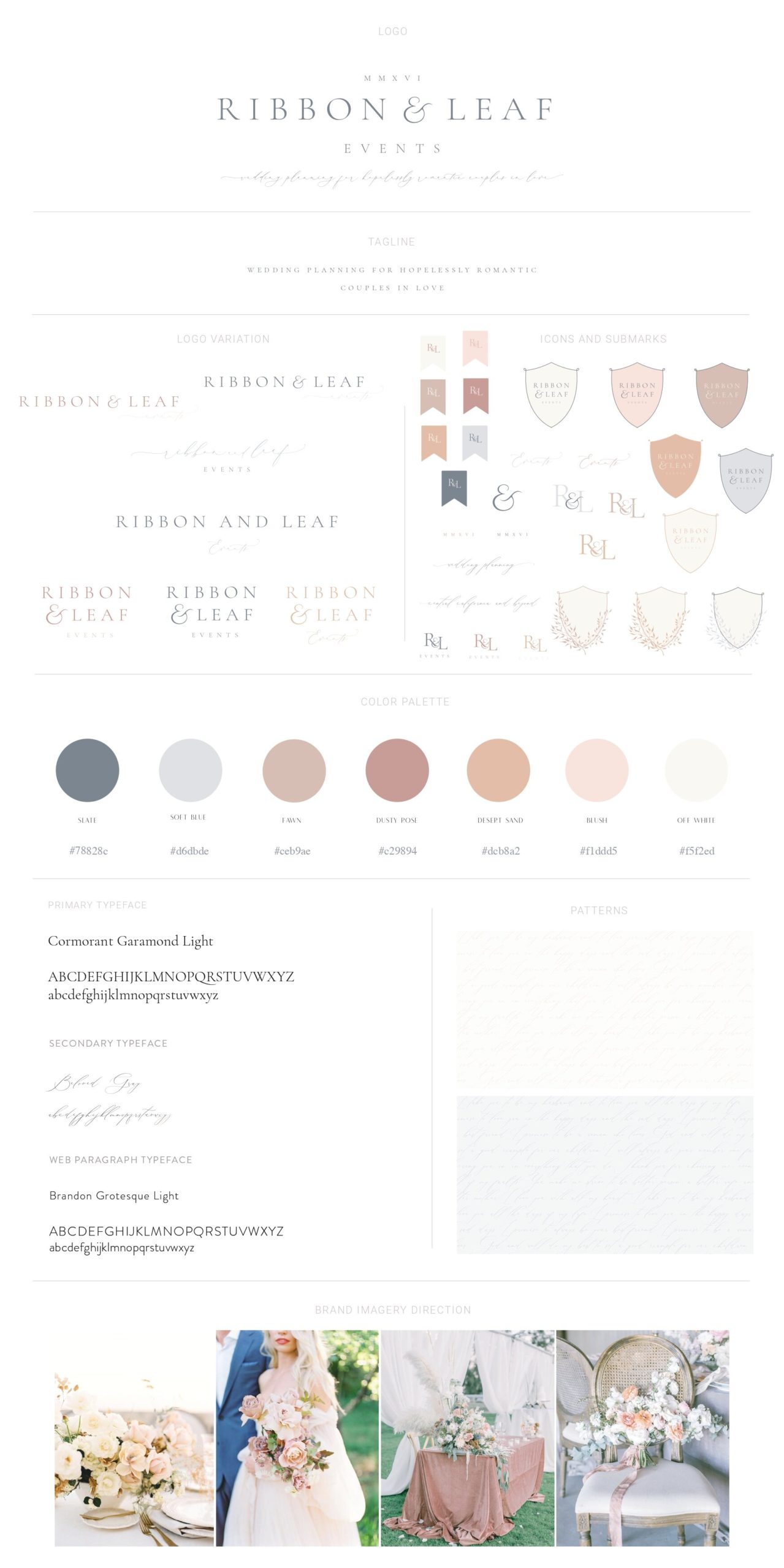
Ribbon and Leaf Events is a wedding planner for hopelessly romantic couples in love, serving Central California and beyond. Through elevated type pairings and a soft color palette we positioned the brand as sophisticated and high-end with a romantic aesthetic.
SERVICES: BRAND STRATEGY & DEVELOPMENT, PRINT COLLATERAL & GUIDE DESIGN
Today I’m sharing one of my all-time favorite branding projects-a gorgeous rebrand for an extremely talented wedding planner. It was such an honor to work with Katie from Ribbon and Leaf Events to craft a bespoke brand together that would truly serve her best.
When Katie first came to me, she was entering into a new season of business and she wanted to rebrand and create a brand that reflected the level of service she offers her wedding couples. Together, we crafted a truly unique brand that looks and feels like her while attracting her ideal client at the same time.
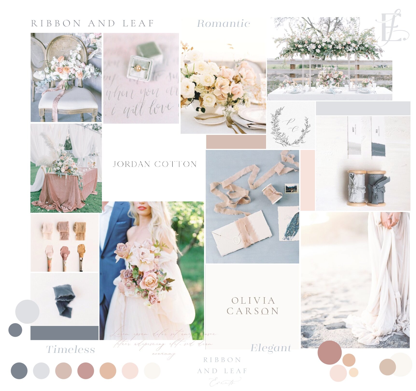
Direction Board
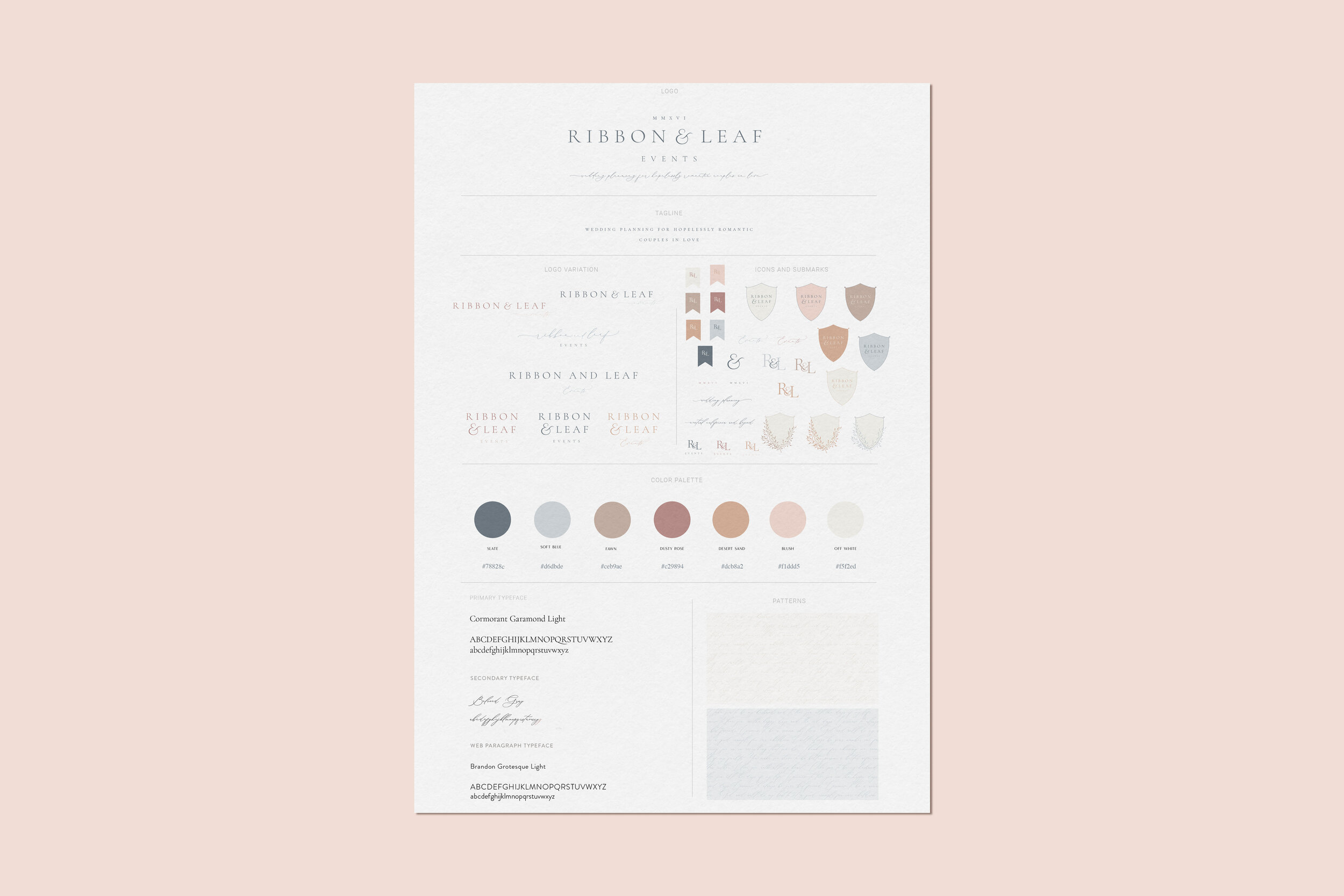
final style guide
The Design Process
The jumping off point for the entire brand was the warm color palette that we pulled directly from her brand imagery. Katie has such a warm personality and she truly gives her clients a one-of-a-kind experience and we wanted that to be reflected in her branding.
With a name like Ribbon and Leaf Events, we had plenty of design elements to play around with in the design process. Katie knew she wanted some type of crest and from the get-go and I wanted to explore the idea of a crest made of leaves. The result turned out beautifully. We ended up creating three variations of the crest for her to use across her platforms.
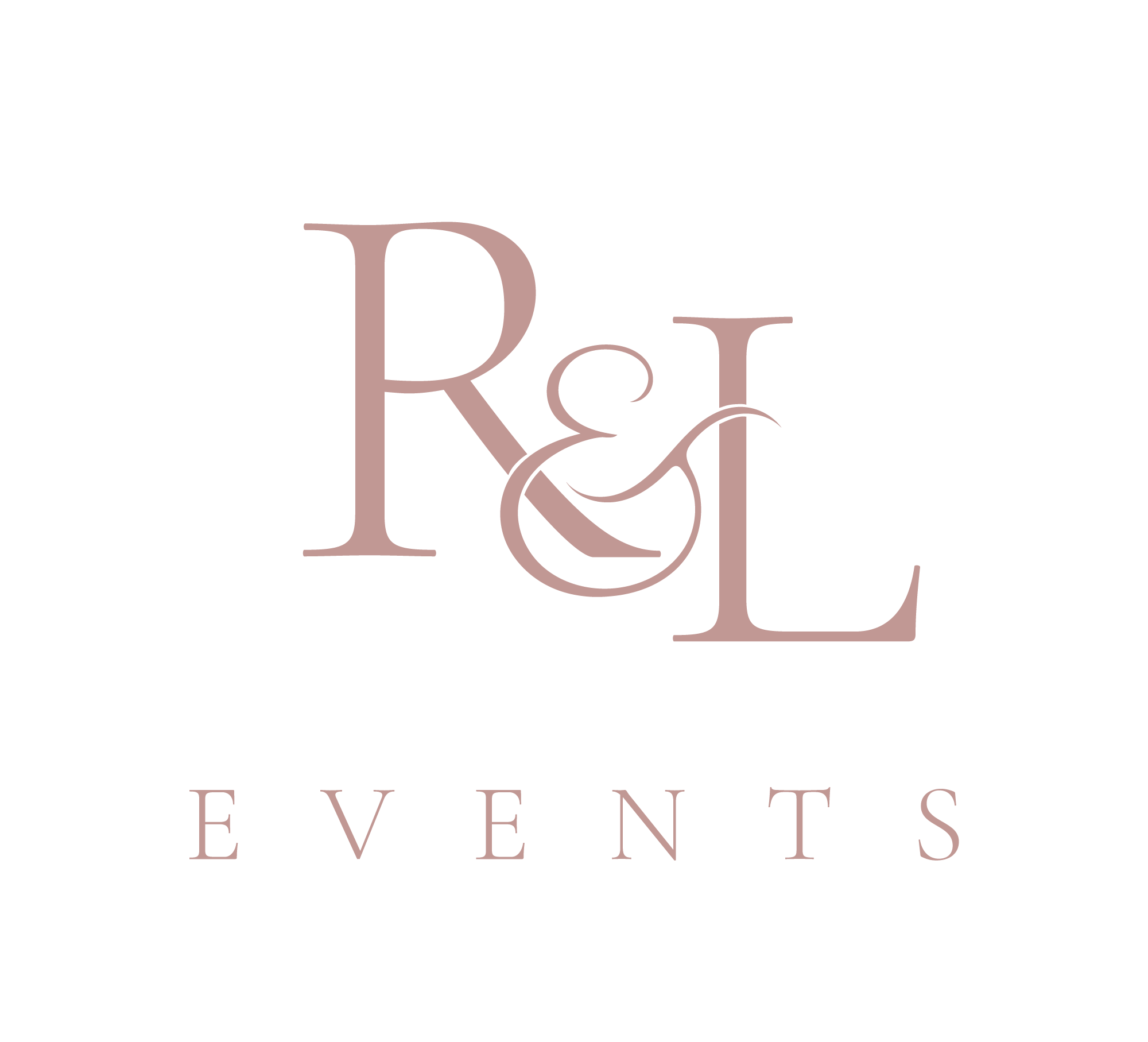
For the main logo, we kept it minimal and the typography and custom ampersand is the show stopper. I absolutely love the elevated feel the curves of her ampersand mark bring to her stacked logo variation. Through intentional typography pairings, we were able to create a classic logo that will serve her for years to come.
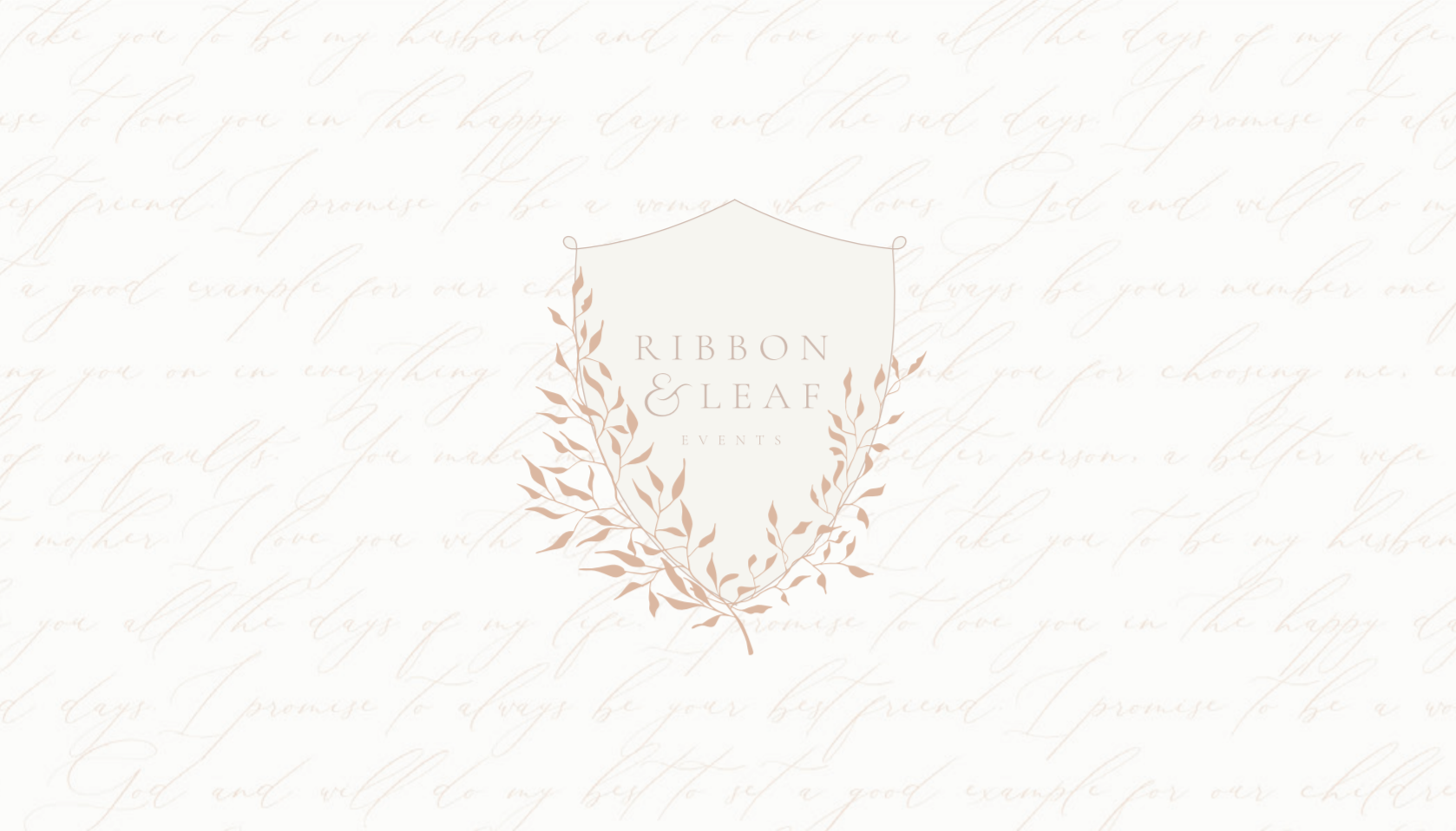
We created the patterns for this brand using Katie’s wedding vows. I absolutely love it when there is an opportunity to add a personal touch to a client’s brand.
Main Logo


Logo Variations
BRAND ELEMENTS & SUBMARKS
patterns


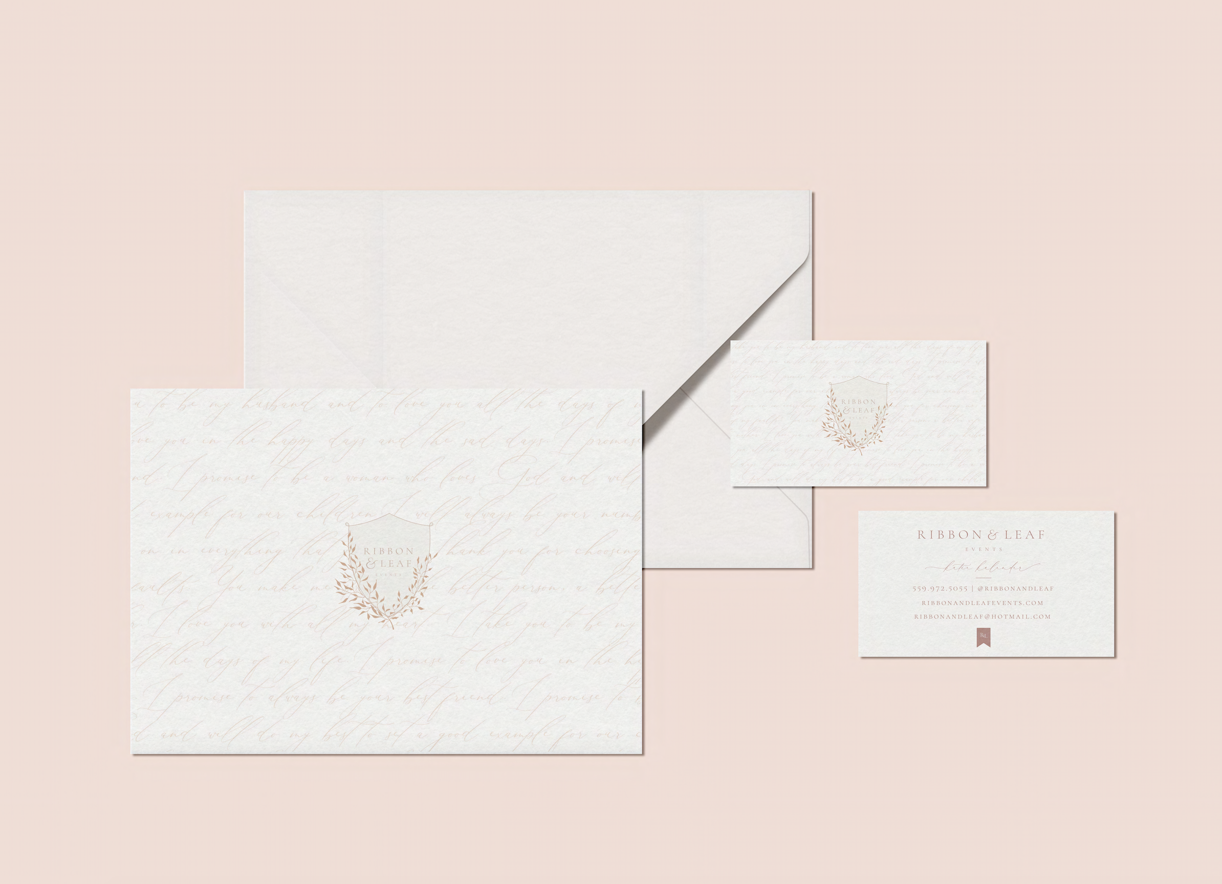
Business Card design
Stationary Design
Guide Design
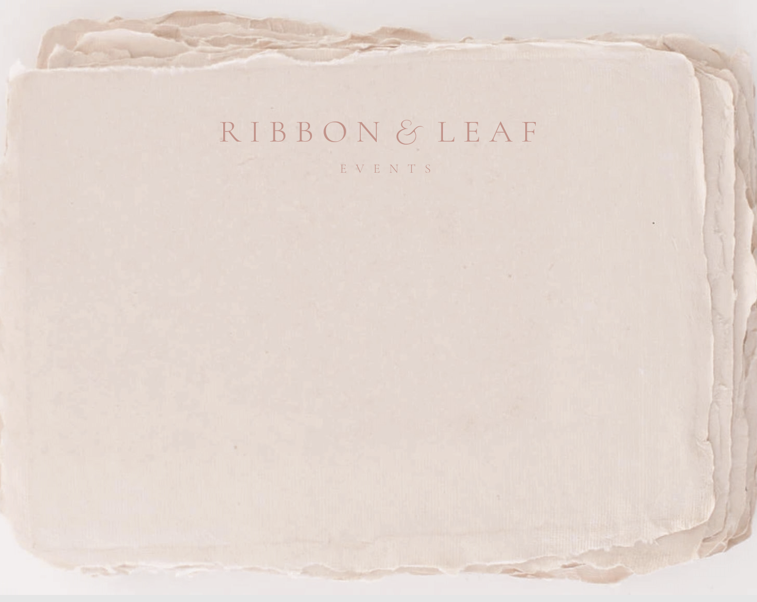
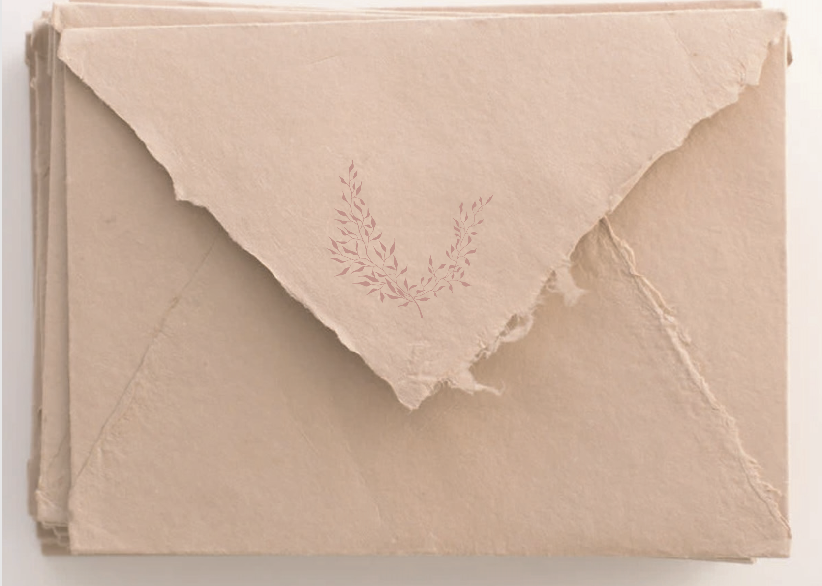
After we walk through our Signature Artful Branding process, we move onto designing the print collateral. For Ribbon and Leaf Events, we designed two options for her print suite- the first was a traditional fold-over thank you card where we put the beautiful patterns into action. We also presented a truly unique handmade notecard and envelope in her brand colors.
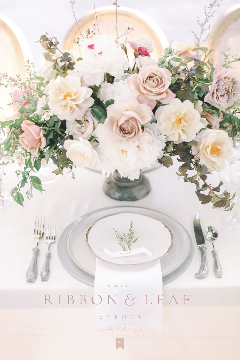
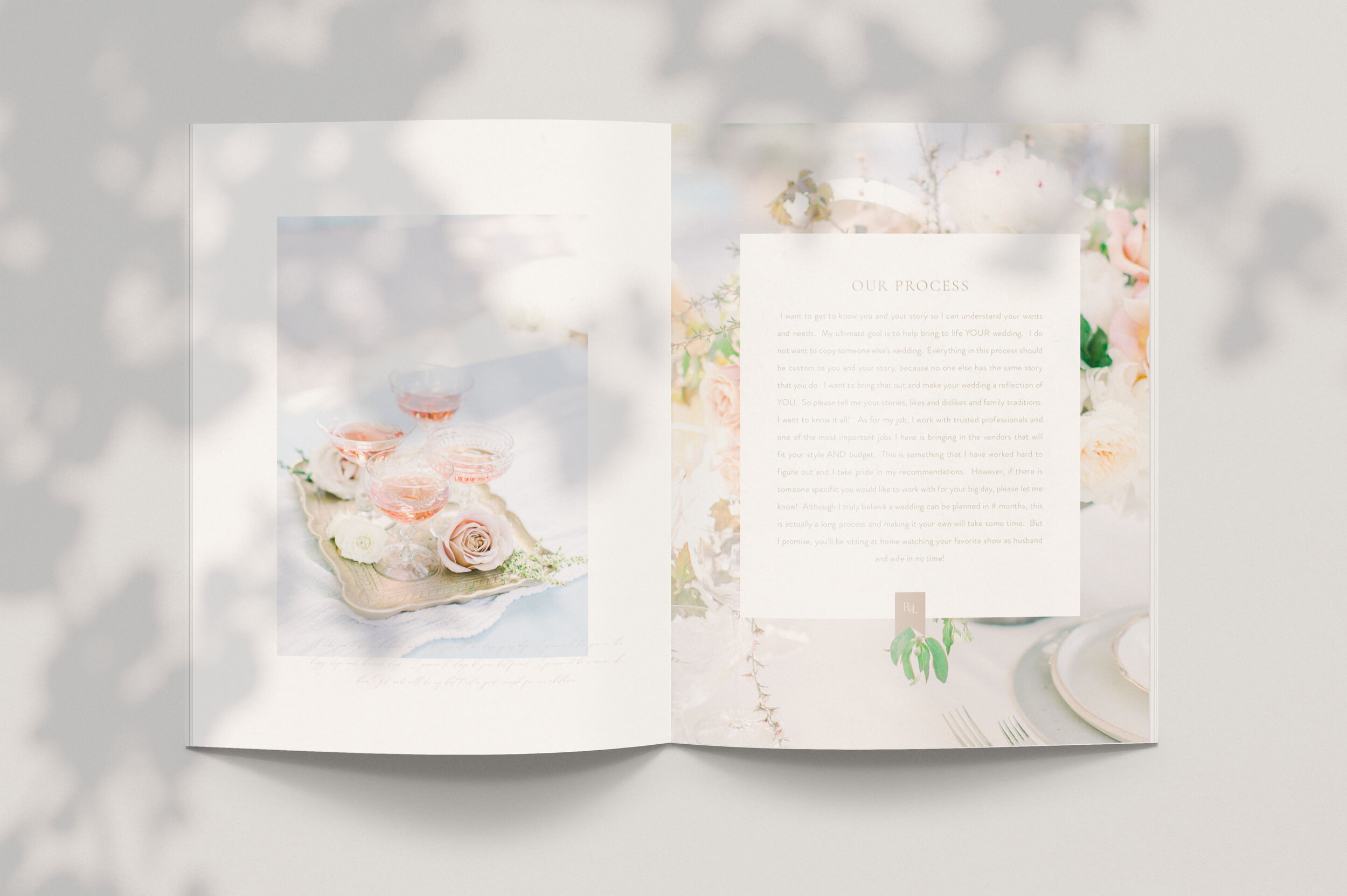
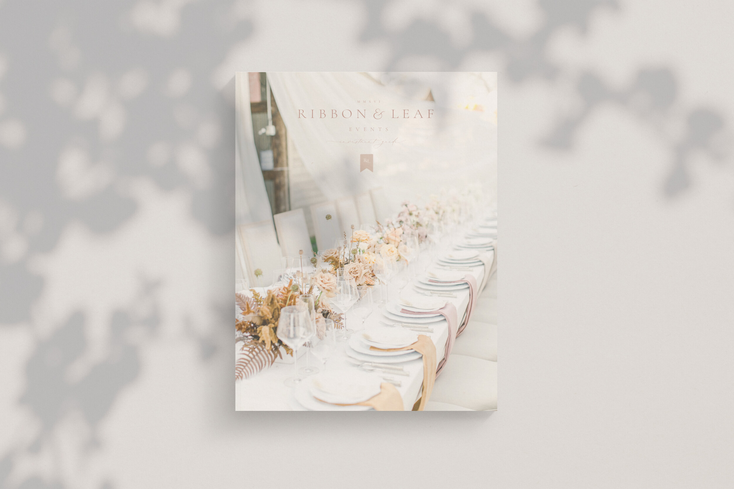
We also designed a custom Welcome and Investment Guide to elevate her client experience even further. Katie had absolutely beautiful brand imagery so she made my job easy! I love the impression custom designed guides can make on your clients to welcome them into your elevated experience and set clear expectations up front.
I love working so closely with my custom branding clients because I get to know incredible women in business like Katie. This was such a dream project and I’m so honored that creative women in business trust me to bring their vision to life.
Are you ready to elevate your brand? I’m currently booking full brand build outs for an early September start date. If you’re looking for a complete rebrand + custom website design or Shopify site design I would love to talk you through the process and see if we are a good fit for each other! Click below to get started.
READ MORE POSTS LIKE THIS
POST CATEGORIES
SEARCH THE SITE
I’m Katie, the brand strategist, designer, dreamer, and entrepreneur behind Artful Brands. Dreamy typefaces, clean layouts, and soft color palettes are my love language— but more importantly designing strategic brands that book.





Design
Design
Read More →
Design