
J. Kirk Darling is a Twin Cities based real estate brand with mid century modern vibes. Through a dark and moody color palette with rich colors and textures we positioned the brand as confident, trustworthy, established, and knowledgable to attract serious home buyers.
SERVICES: BRAND STRATEGY & DEVELOPMENT, PRINT COLLATERAL, & GUIDE DESIGN
I am so excited to finally share a custom branding project from earlier this year for my 1 on 1 branding client, J. Kirk Darling Real Estate! Kirk is a realtor serving the greater Twin Cities area and beyond and it was such an honor to design a bespoke brand from the ground up that is truly unlike anything I’ve ever designed before.
When Kirk first came to me he was looking for an elevated and strong brand foundation that would set him apart in an oversaturated industry with the goal of fostering long term relationships to win repeat customers. I immediately knew Kirk and I could create something completely outside of my normal design aesthetic that would serve him well for years to come.
So without further ado, let’s jump into the design process.
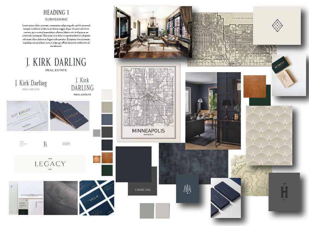
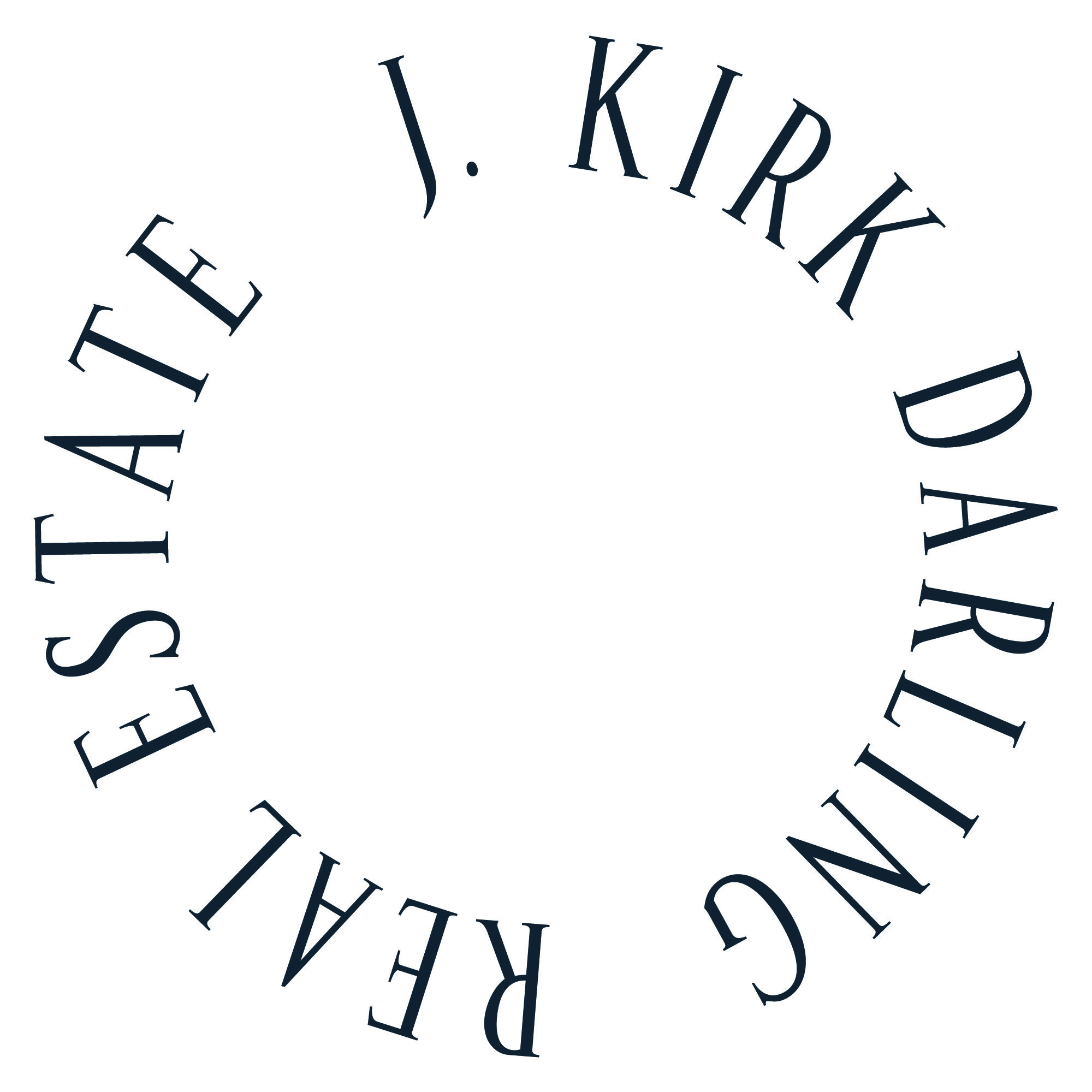
Direction Board
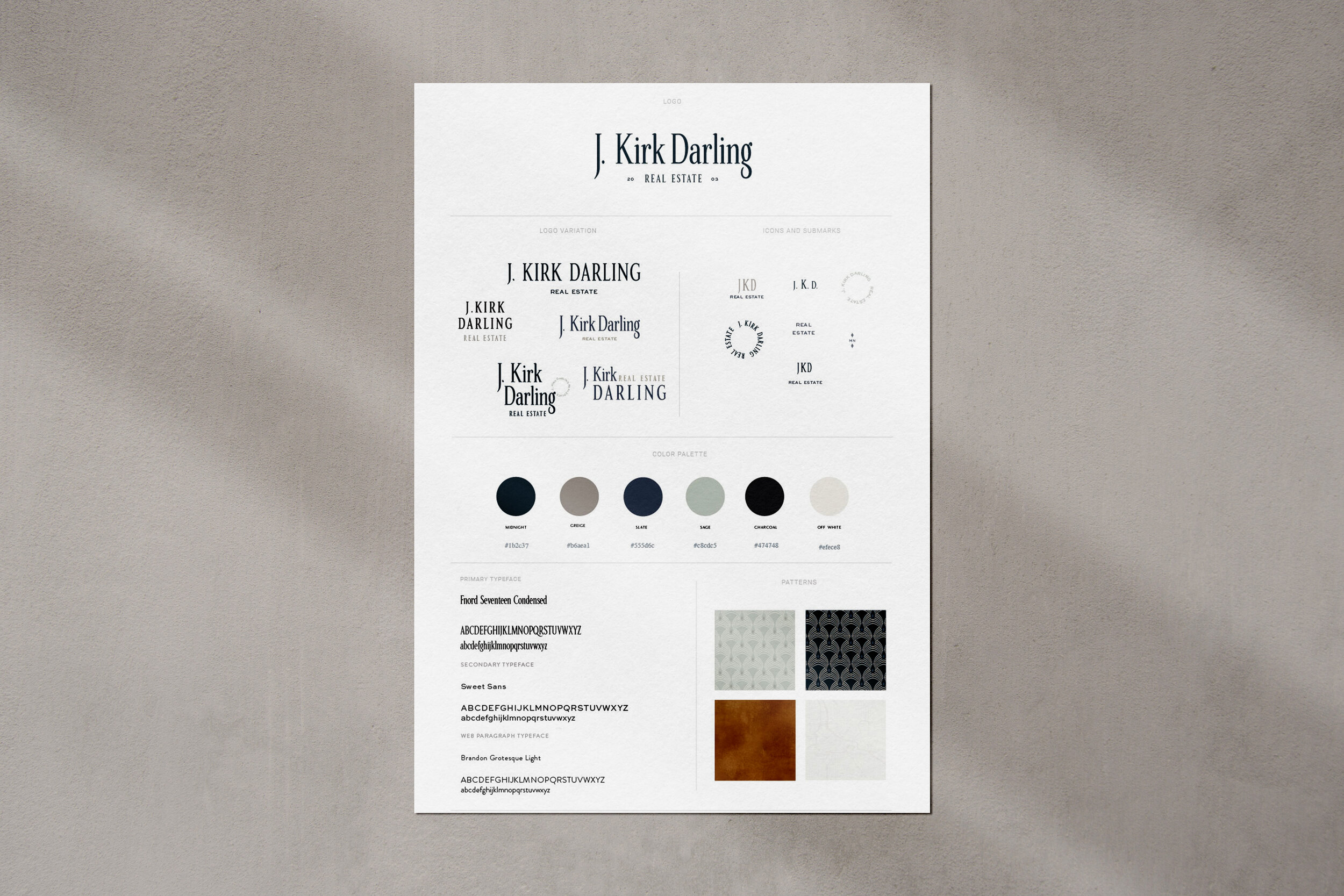
Final Style Guide
Direction
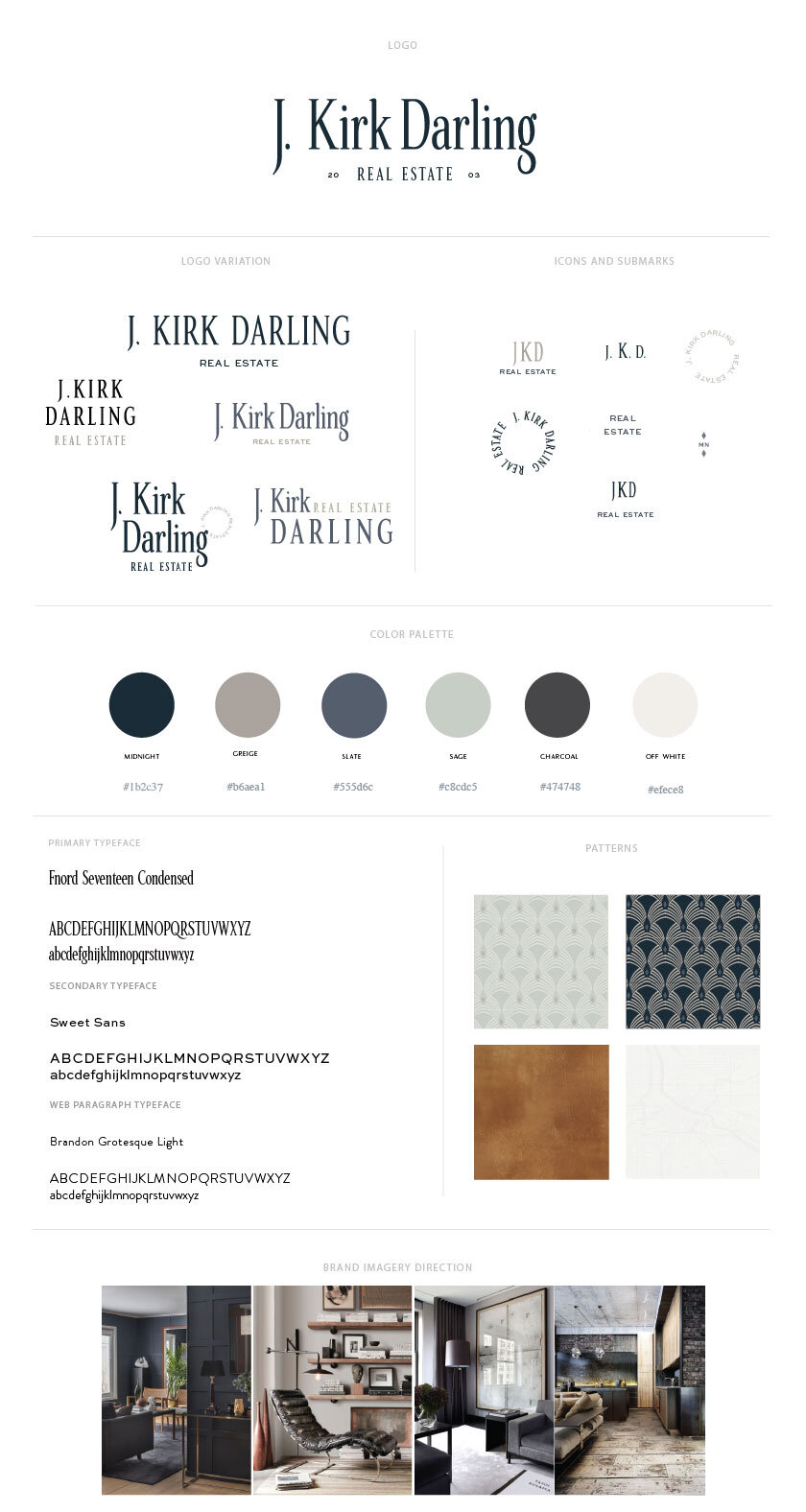
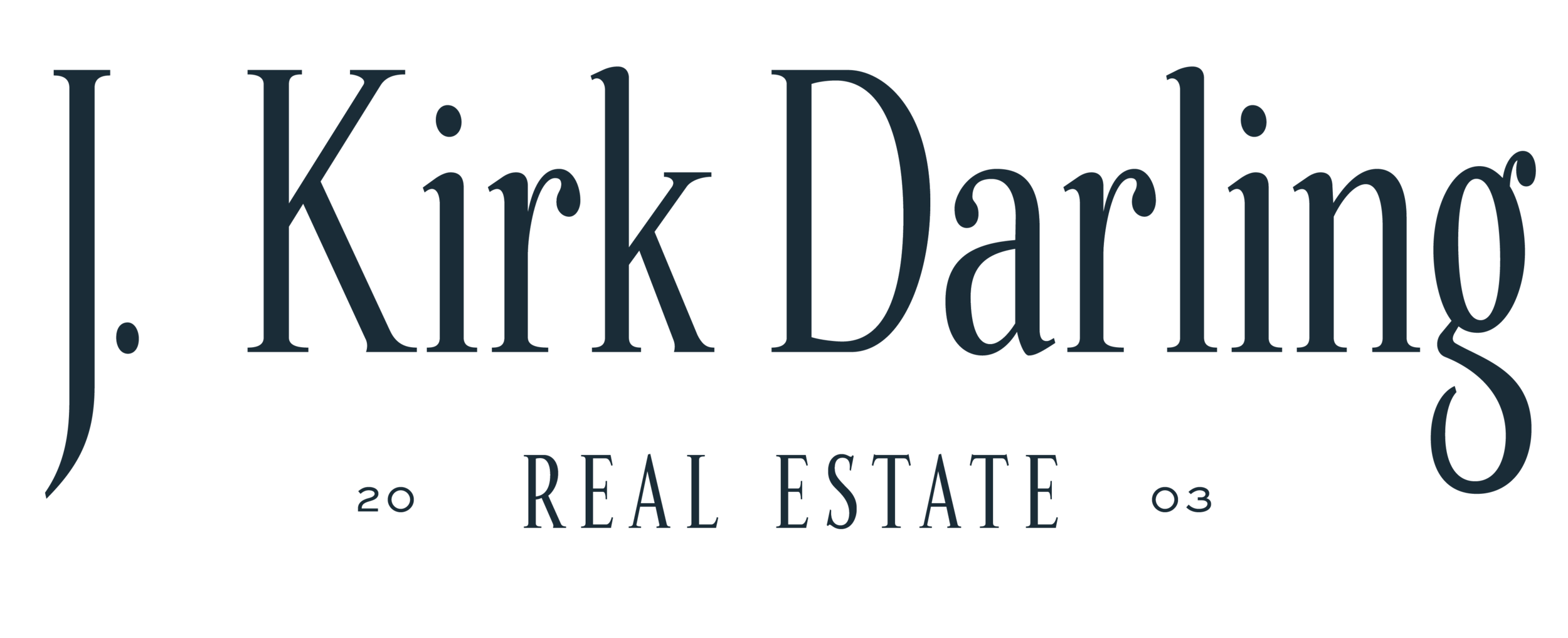
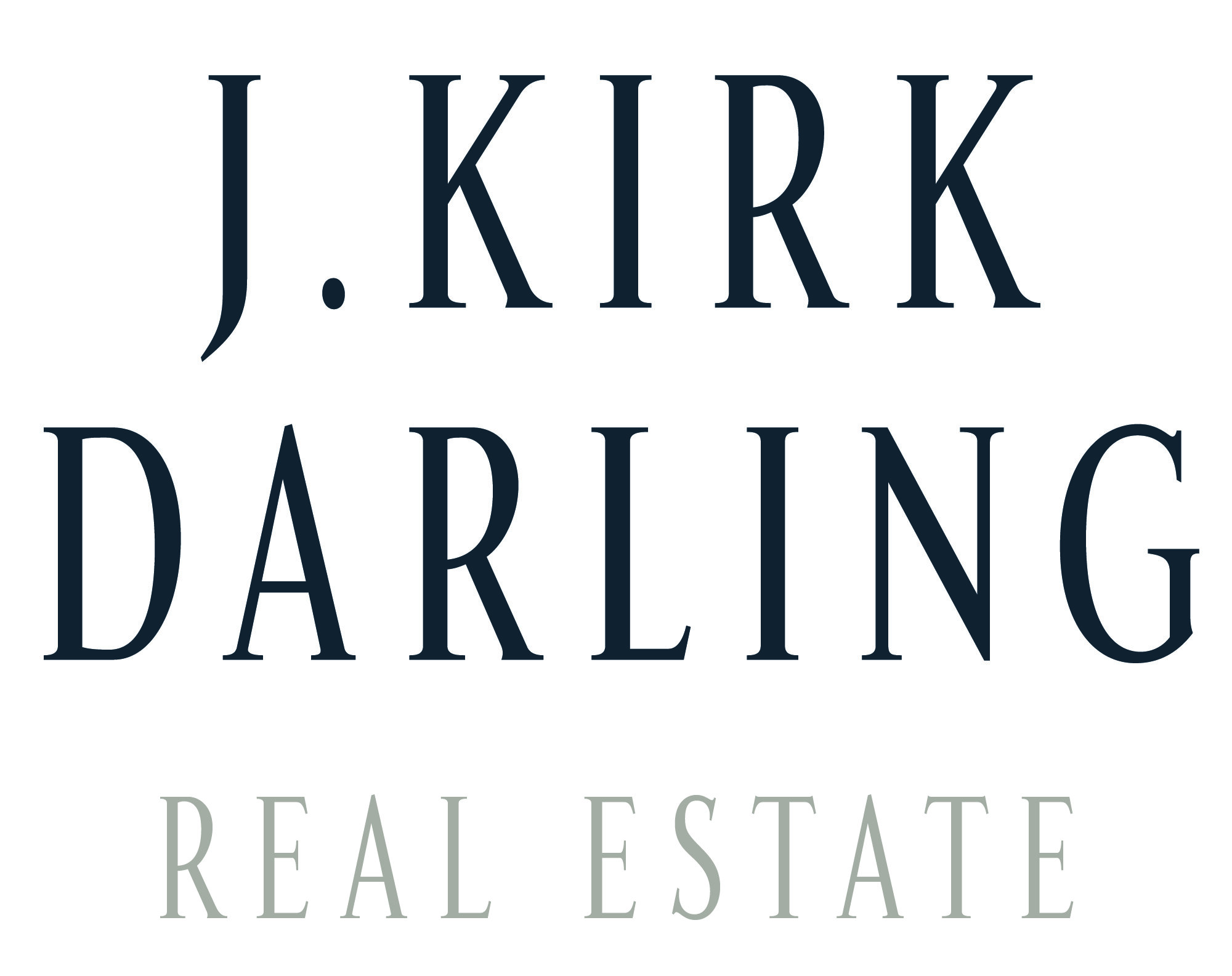
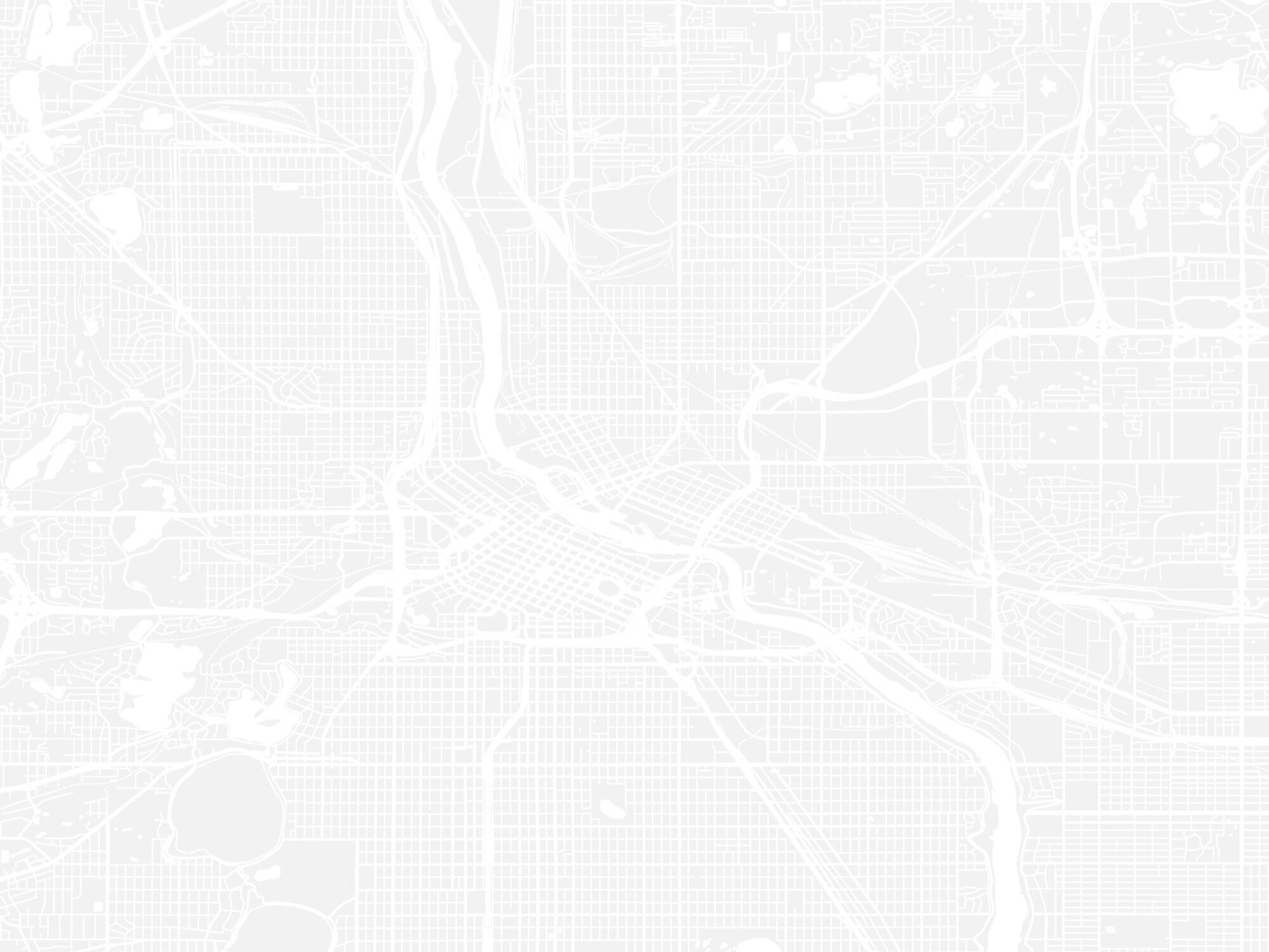
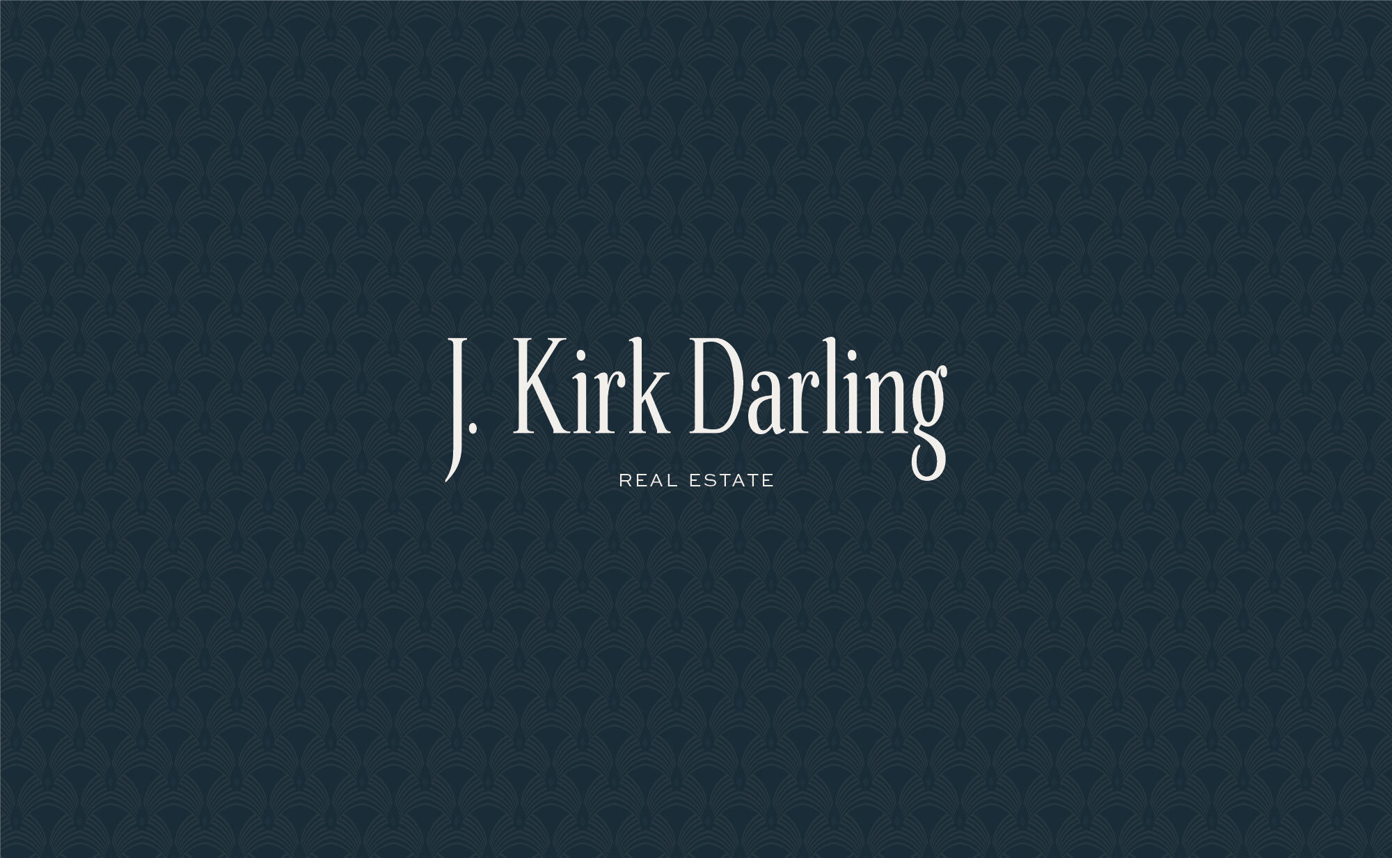
The J. Kirk Darling brand strikes a masculine and elevated look and feel through an elongated typeface, a dark and moody color palette, and rich custom textures. My jumping off point for the brand was a vintage map of Minneapolis (see above) and an art deco design as pattern inspiration.
The Design Process
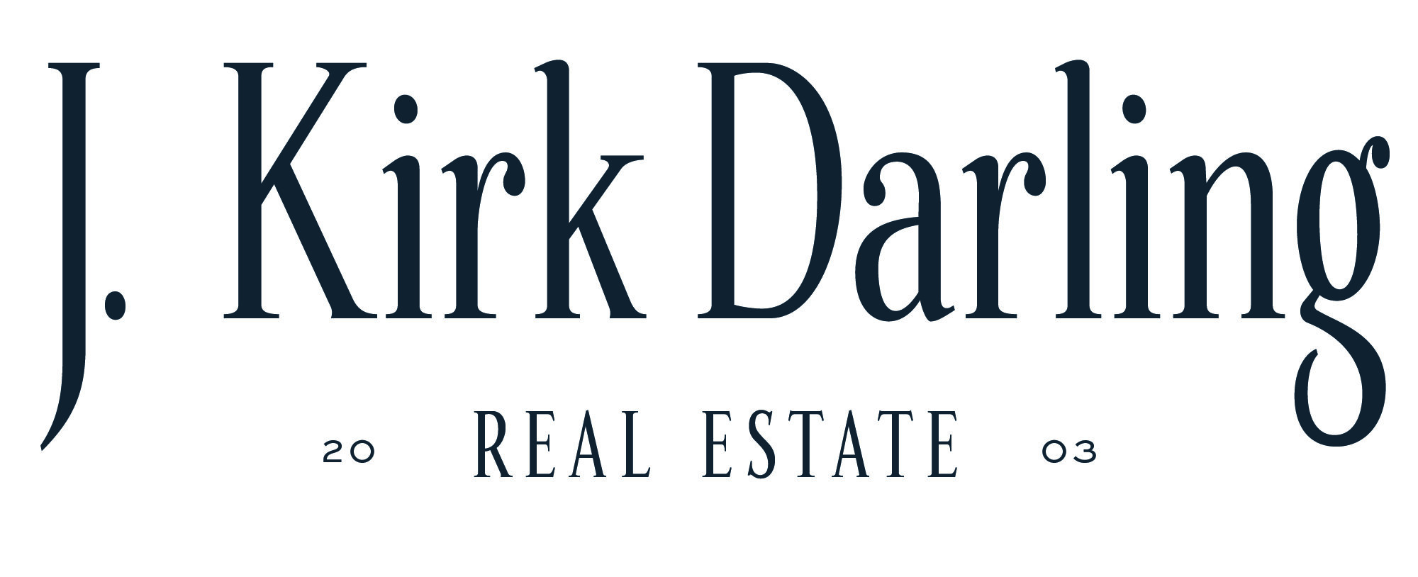
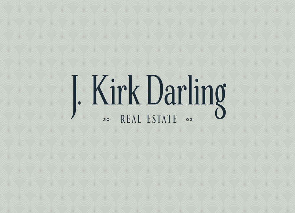
Through the elongated typeface and dark color palette, we were able to give the brand a more established feel with the goal of creating a credible, confident, and trustworthy brand to attract serious home buyers. After a few revisions, we chose to go with a less is more look with the brand’s submarks and I couldn’t be more thrilled with how it all came together.
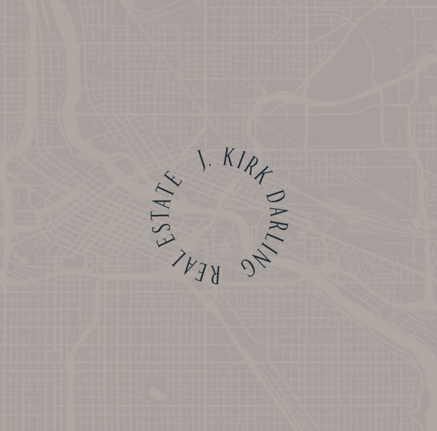
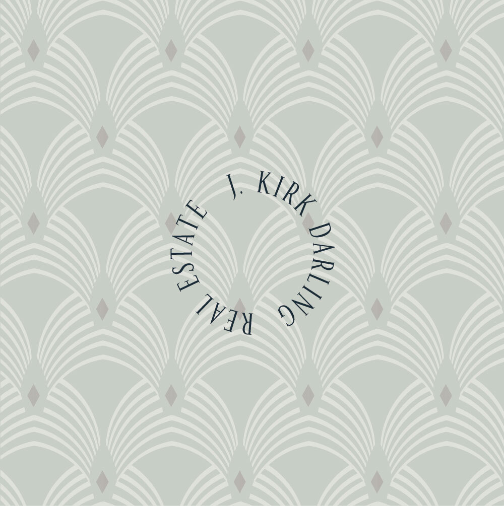
Main Logo
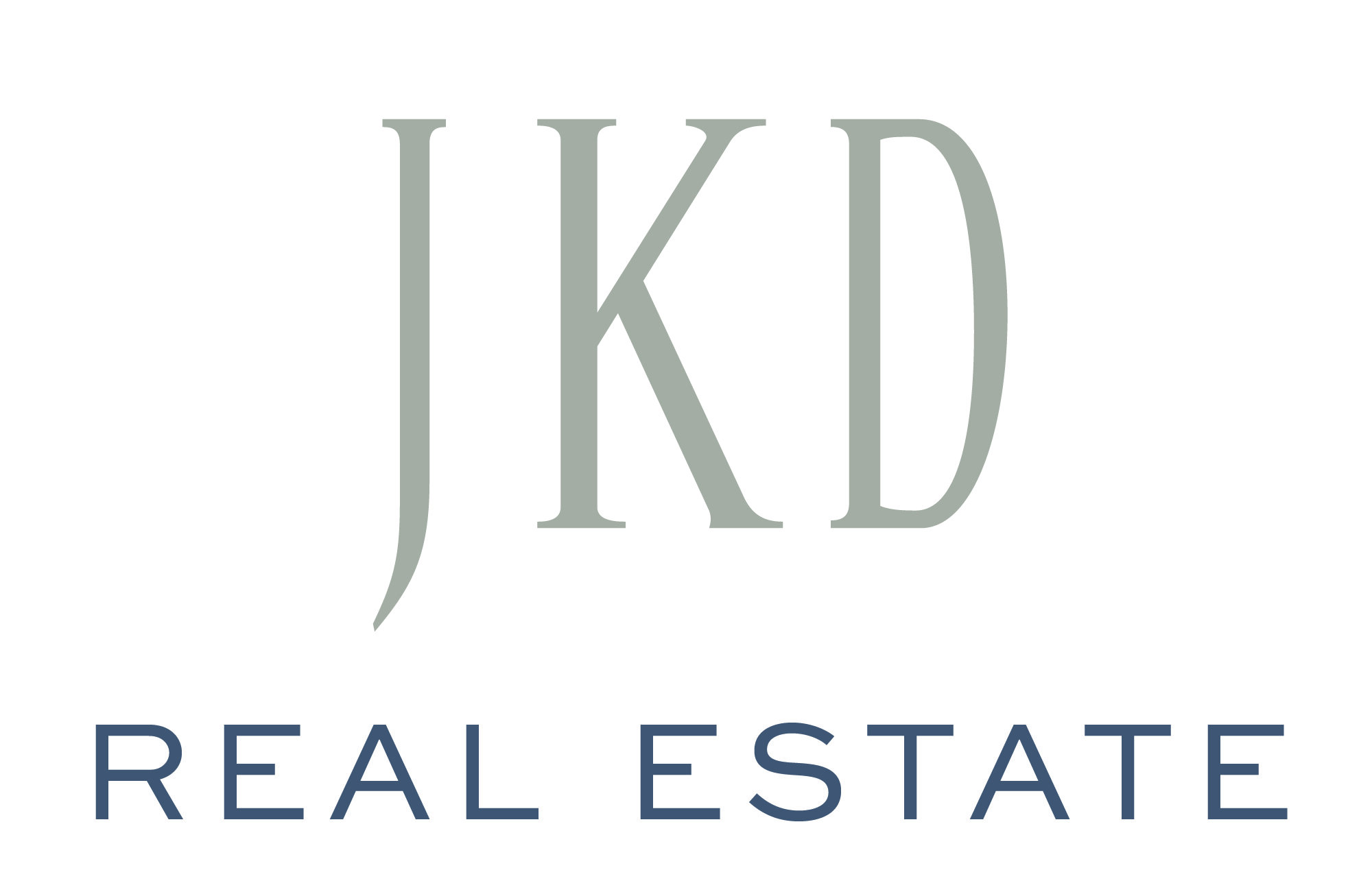
Logo Variations

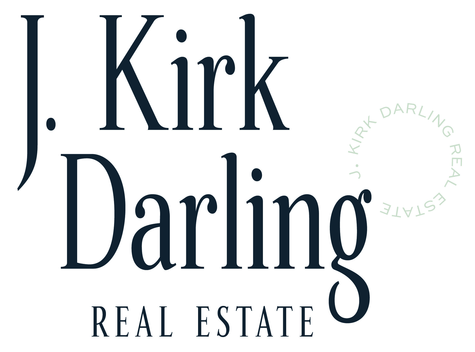
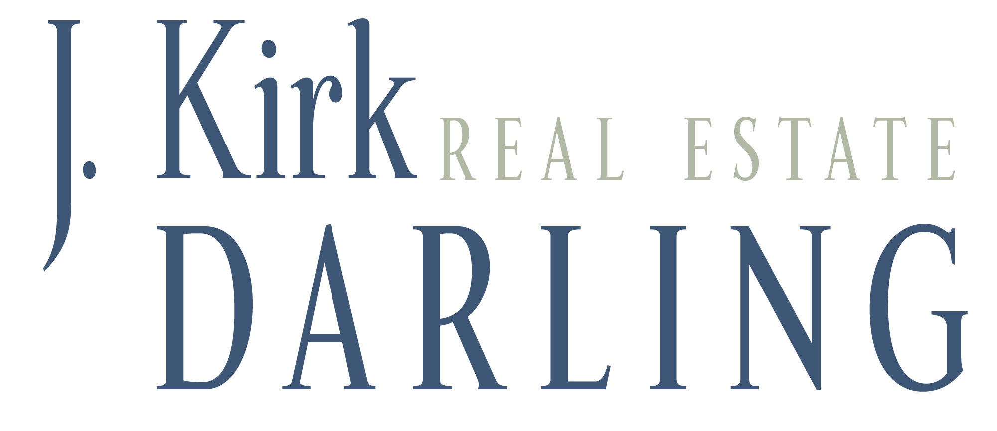
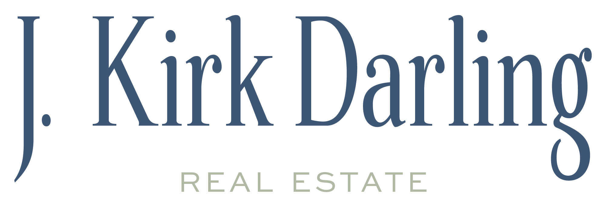
BRAND ELEMENTS & SUBMARKS

How did you feel about your brand before we started working together?
I didn’t have a brand of my own before I worked with Katie. My brokerage has very strong local brand recognition, but I was looking to differentiate. I felt I needed something that reflected who I am and how I fit into the fabric of my industry; something I would feel confident in allowing to represent me in every touch-point throughout my marketing and client communication. That was a tall task.
What was your experience like working with Katie?
Katie made the process fun from the word ‘go’. She’s also incredibly disciplined and on-task. Any hiccups or delays in our process together were solely from my end…and even then, Katie was gracious and incredibly helpful. There’s a bit of soul-searching required to make final decisions about a new brand, and Katie was a thoughtful guide throughout that sometime’s challenging process.
How has working with Katie changed the way you think about your business?
As a service provider myself, I focus almost solely on the needs of my clients. The process of designing a new brand is inherently a selfish one. Looking at my own business as something deserving of high quality branding has grown my confidence, and given me a larger sense of pride about what I do everyday in my career. Plus, Katie’s confidence and creativity is infectious. Working with great people sharpens one’s skills…and Katie is definitely “great people”!
Would you recommend hiring Katie as a brand designer? Why?
I would recommend Katie as a brand designer without hesitation. Katie genuinely sought to understand who I am and how my business runs before she began applying design decisions to my brand. There was never anything boilerplate about Katie’s design build. Everything was “from scratch”. Not only was my eventual brand reflective of me, but it was clearly reflective of Katie’s understanding of my business philosophy and my personal style.
Patterns


Staying top of mind and corresponding with potential and past clients is extremely important for realtors. One of our goals was to communicate to potential buyers that they are signing up for an upscale experience from a results driven agent that is an expert in the field. Branded touch points are a perfect way to do this.
For Kirk’s print collateral design, we chose to mix and match the custom patterns together and I love the layered look of the art deco pattern on the back of his business card and the Minneapolis map as a subtle background of his notecard.
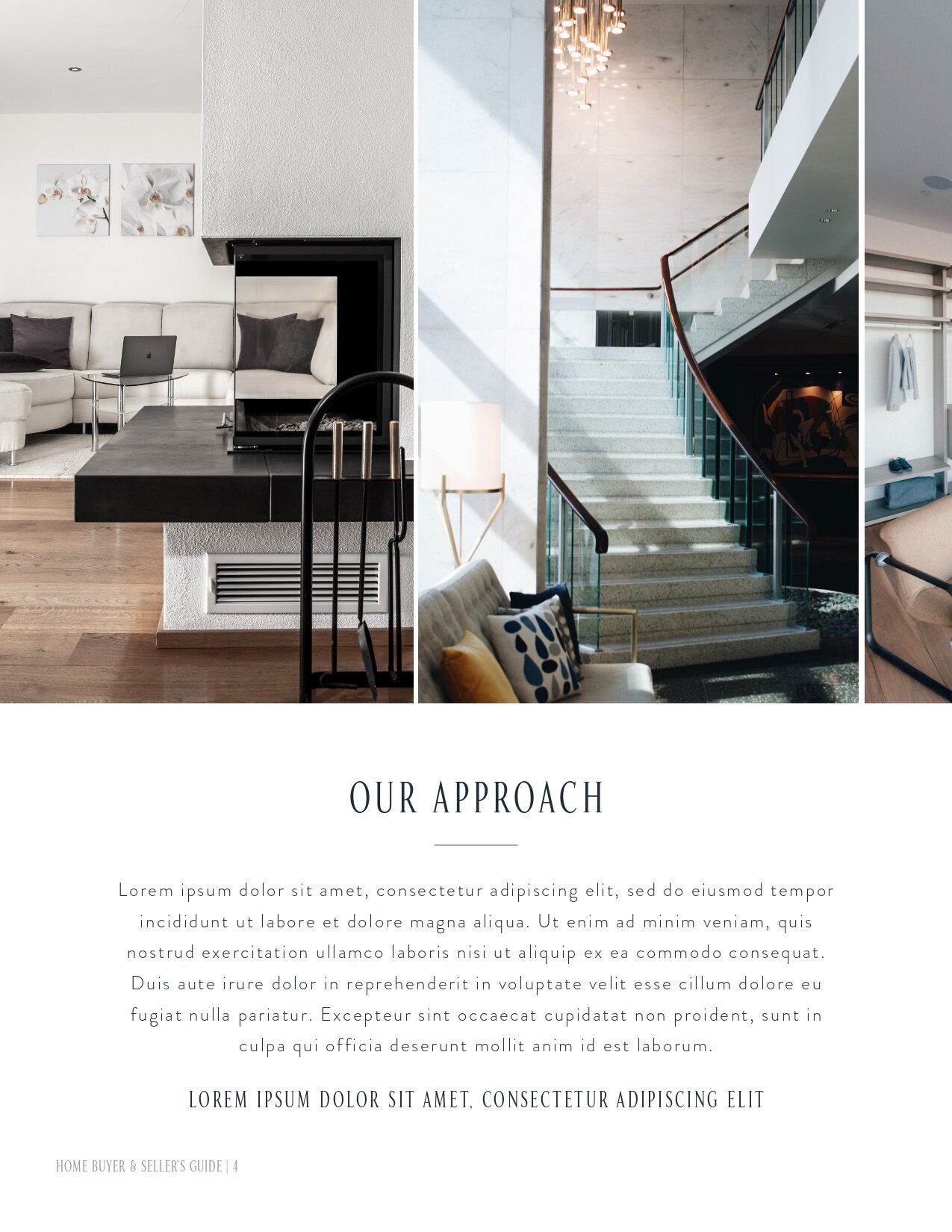
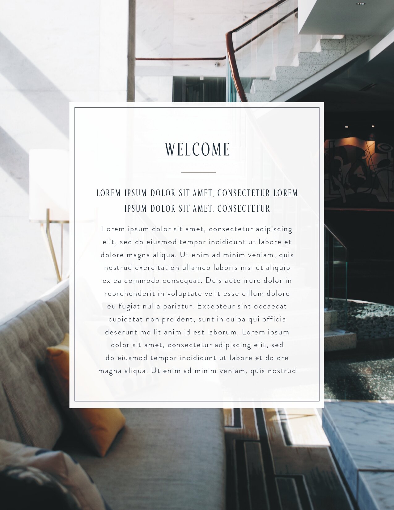
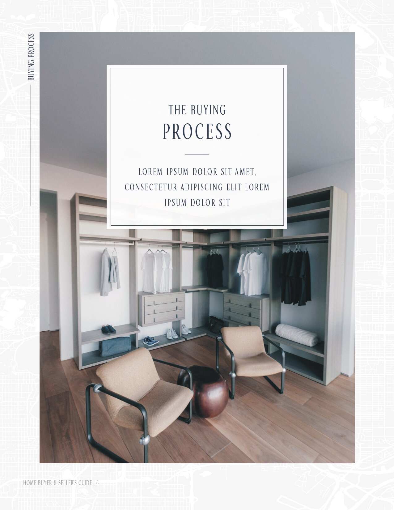
Another way we elevated Kirk’s client experience was through a custom designed buyer and seller’s guide giving potential clients further guidance and added value.
Note Cards & Stationery
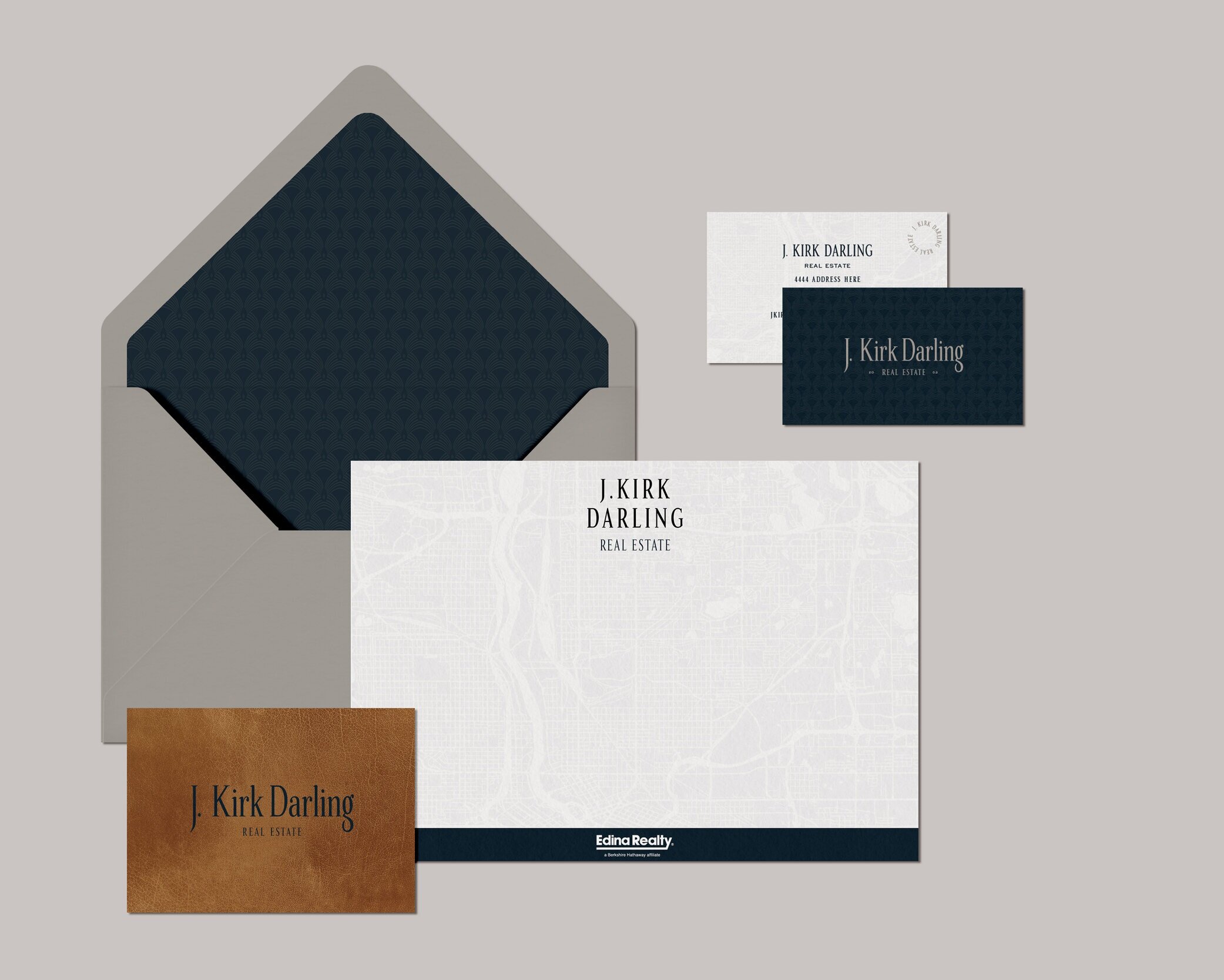
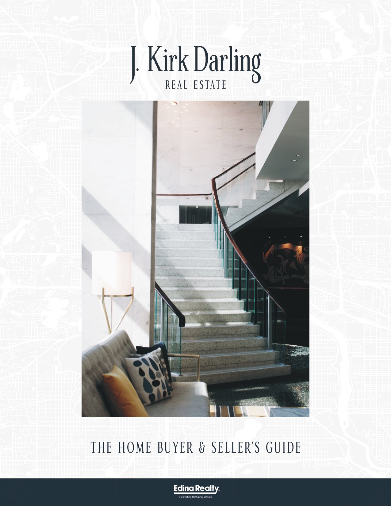
Buyer’s & Sellers Guide
Are you ready to elevate your brand? I’m currently booking full brand build outs for a late August start date. If you’re looking for a complete rebrand + custom website design, Shopify site, or custom branding + print collateral, I would love to talk you through the process and see if we are a good fit for each other! Click below to get started.
READ MORE POSTS LIKE THIS
POST CATEGORIES
SEARCH THE SITE
I’m Katie, the brand strategist, designer, dreamer, and entrepreneur behind Artful Brands. Dreamy typefaces, clean layouts, and soft color palettes are my love language— but more importantly designing strategic brands that book.
Welcome


")
