
Rooted Property Group is a Utah based real estate investment management brand. Through a custom illustrated logo, bespoke patterns, and masculine color palette with rich colors and textures we positioned the brand as confident, trustworthy, established, and knowledgeable to attract serious investors.
SERVICES: BRAND STRATEGY & DEVELOPMENT, PRINT COLLATERAL, SIGNAGe, social media direction
I am so excited to finally share a custom branding project from earlier this year for my 1 on 1 branding client, Rooted Property Group.
Although we were developing this brand from the ground up, the partners were all established business owners with tons of experience in their respective fields. Our first step in creating a strong brand identity was getting on a strategy call and taking a deep dive into their long term goals, ideal clientele, and determine how we could position the brand for success.
So without further ado, let’s jump into the brand strategy and design development.
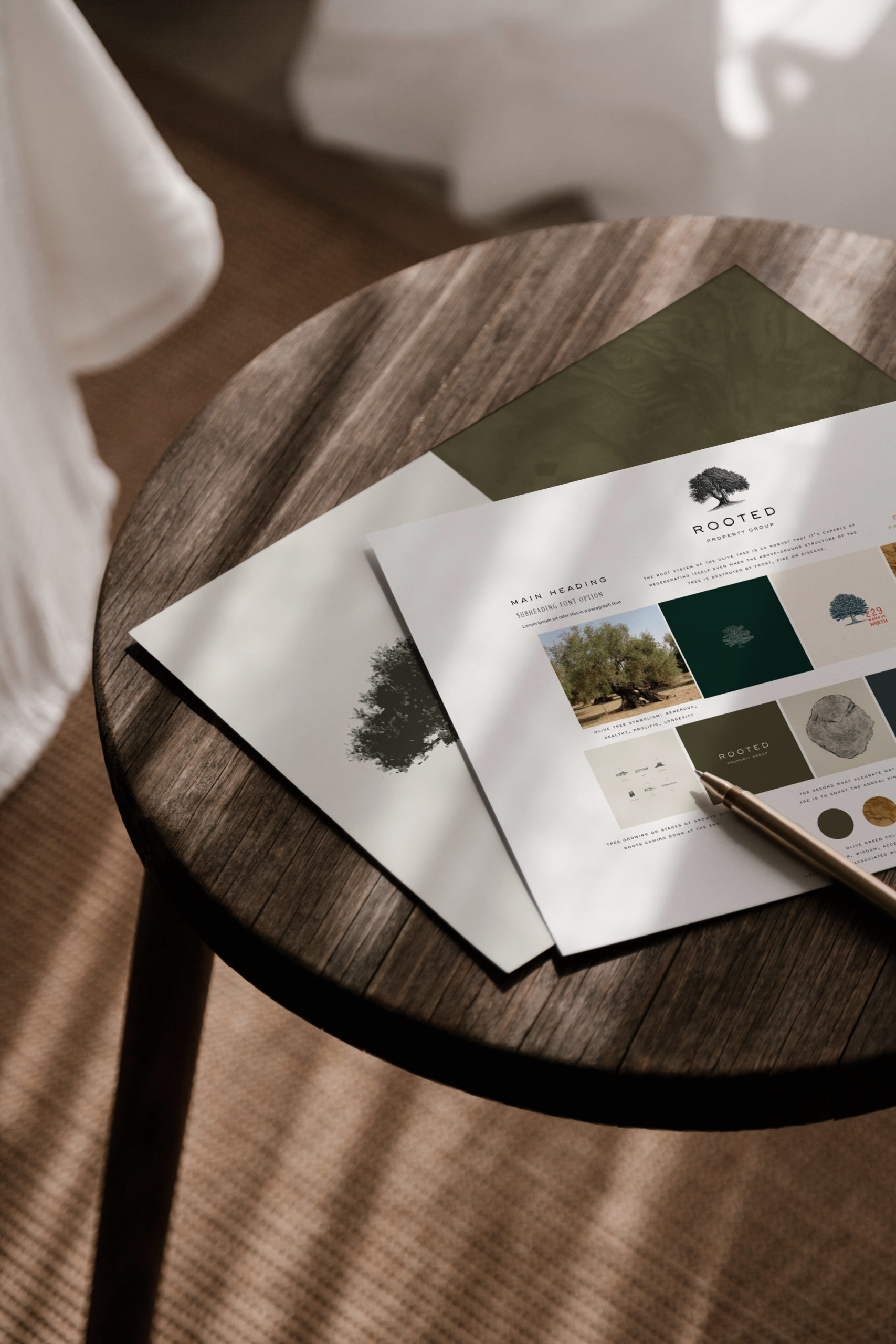
Direction Board
brand strategy
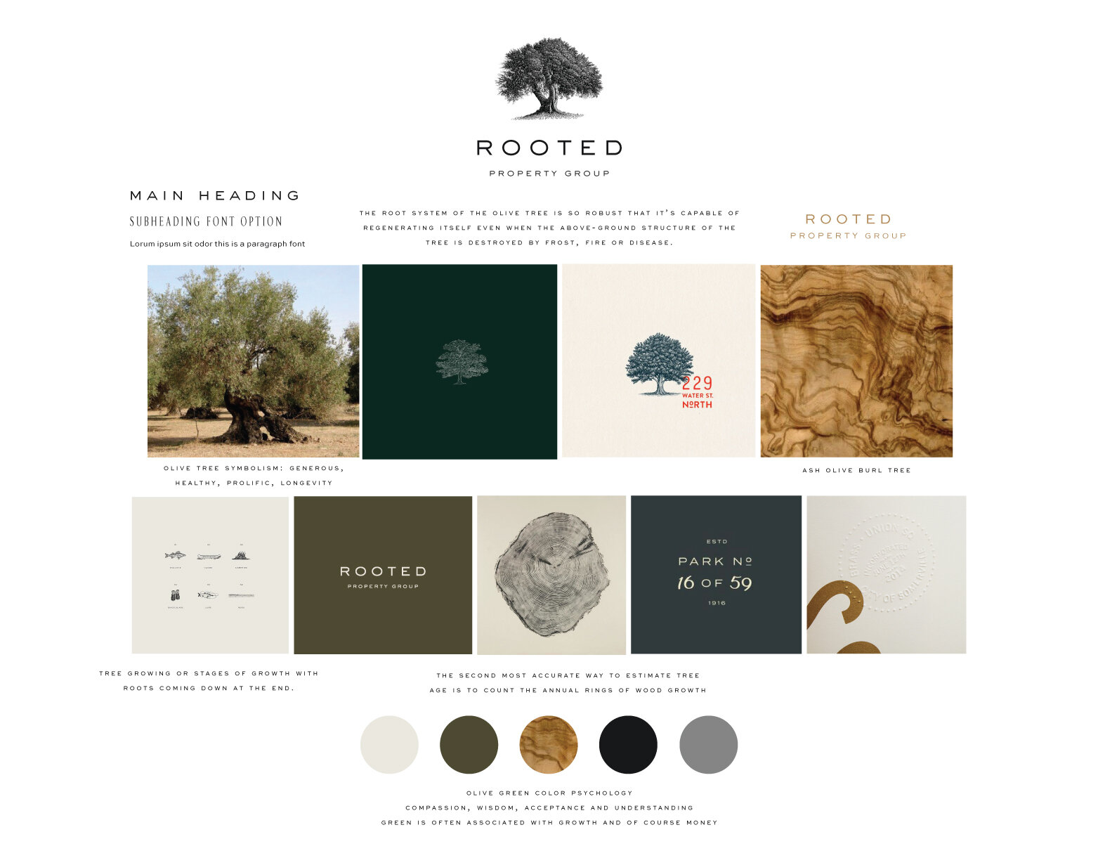
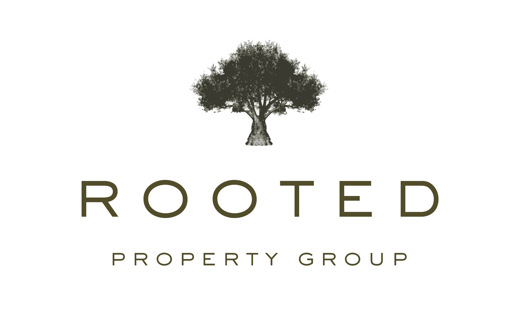
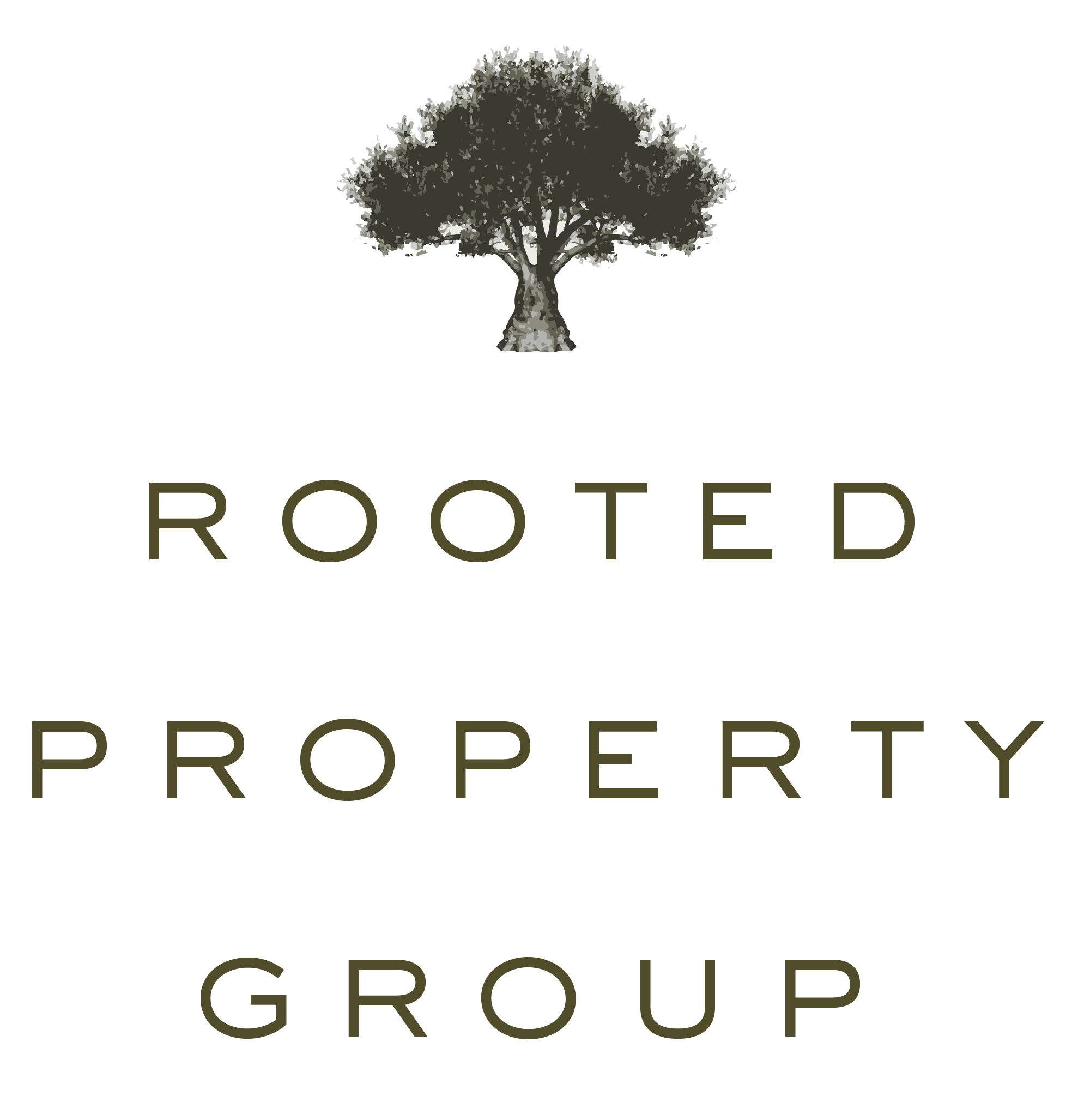
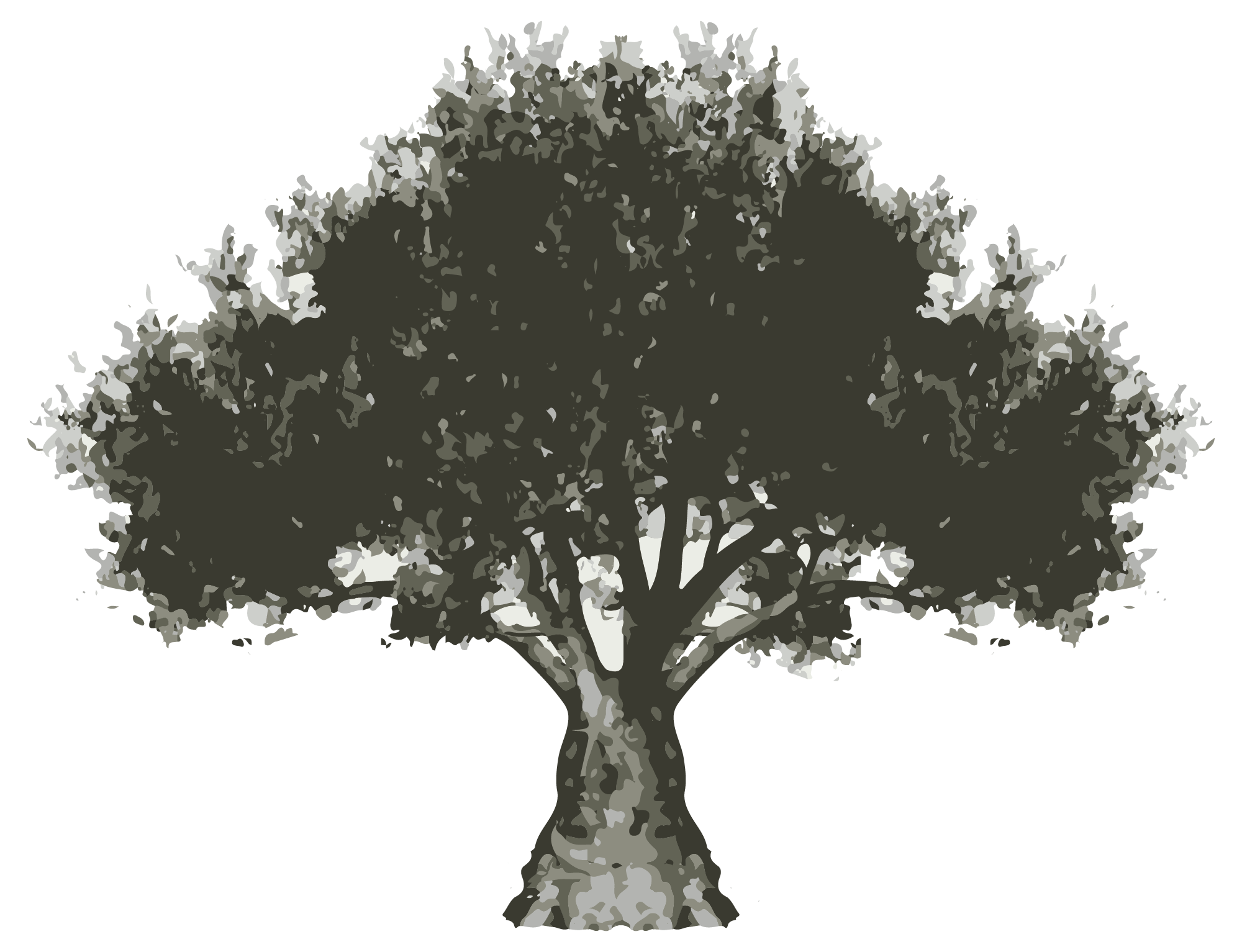
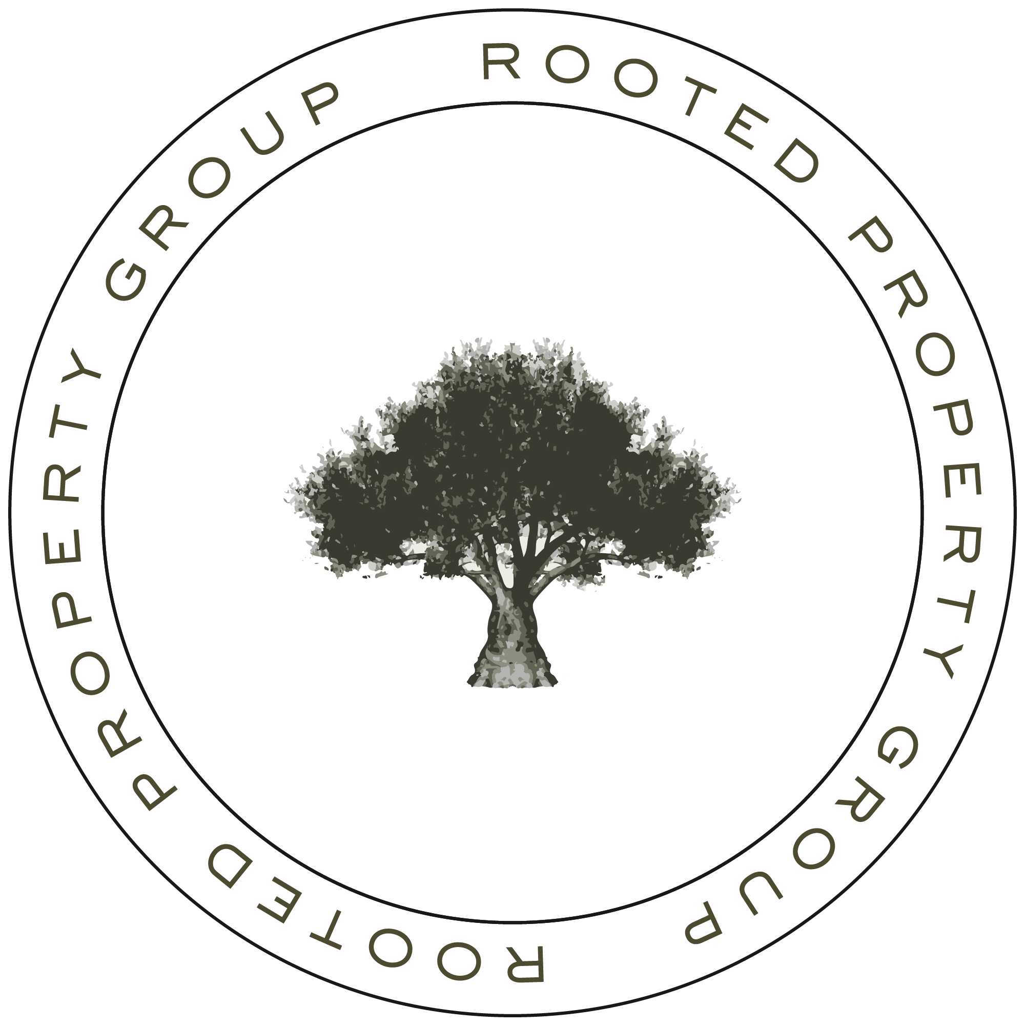
After our strategy session I did some research on trees and immediately thought an oak tree would be the perfect symbolism for the brand. After further collaboration, we landed on the Ash Olive Tree.
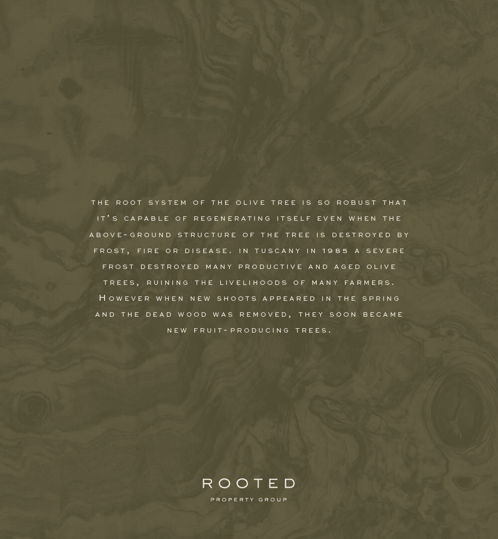
The root system of the olive tree is so robust that it’s capable of regenerating itself even when the above-ground structure of the tree is destroyed by frost, fire or disease. In Tuscany in 1985 a severe frost destroyed many productive and aged olive trees, ruining the livelihoods of many farmers. However when new shoots appeared in the spring and dead wood was removed, they soon become new fruit-producing trees.
The olive tree symbolized everything we wanted this brand to convey- establishing generational wealth, a long-term investment that produces growth, an investment opportunity that is strong enough to withstand the ups and downs of the economy.
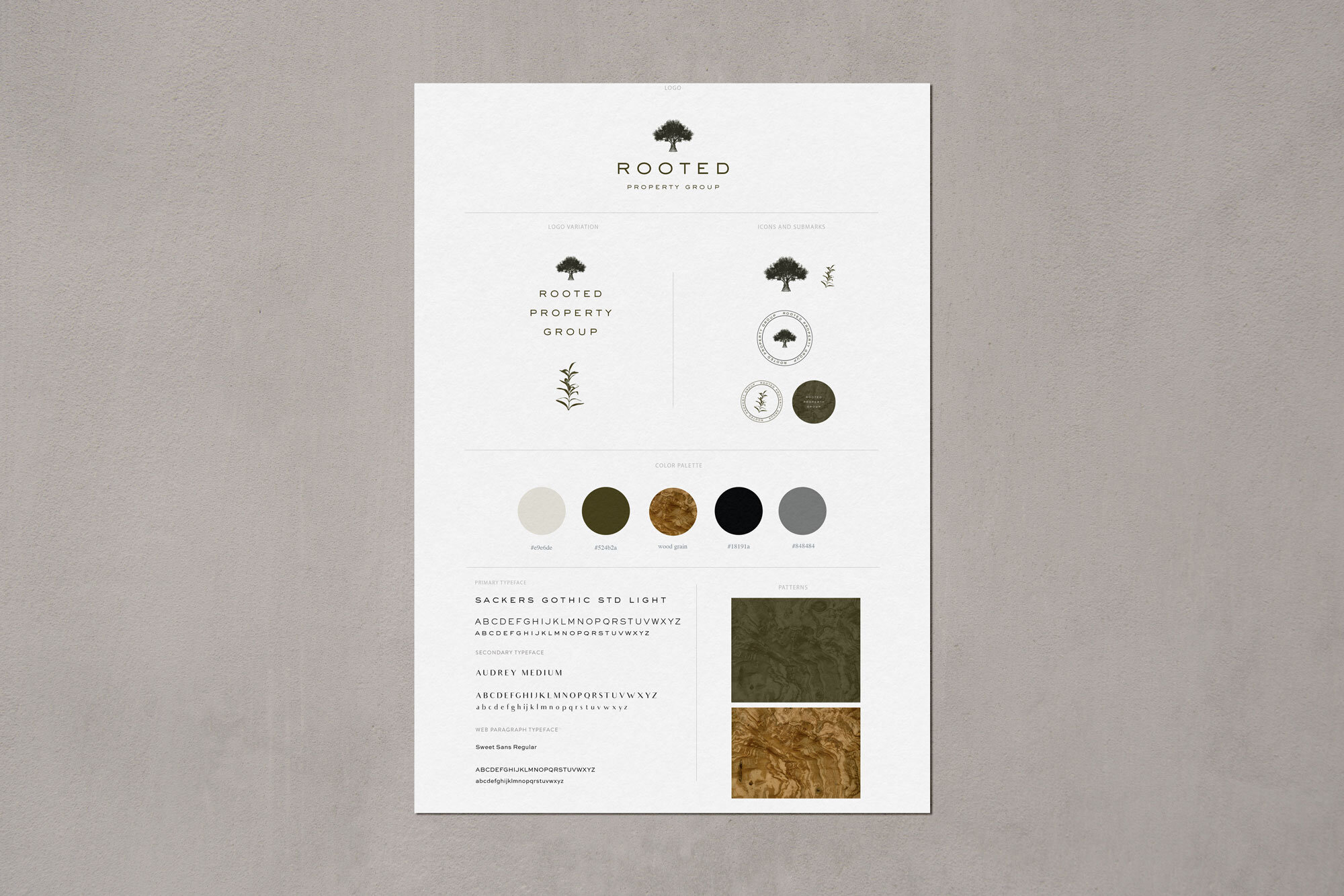
Final Style Guide
The Design Process
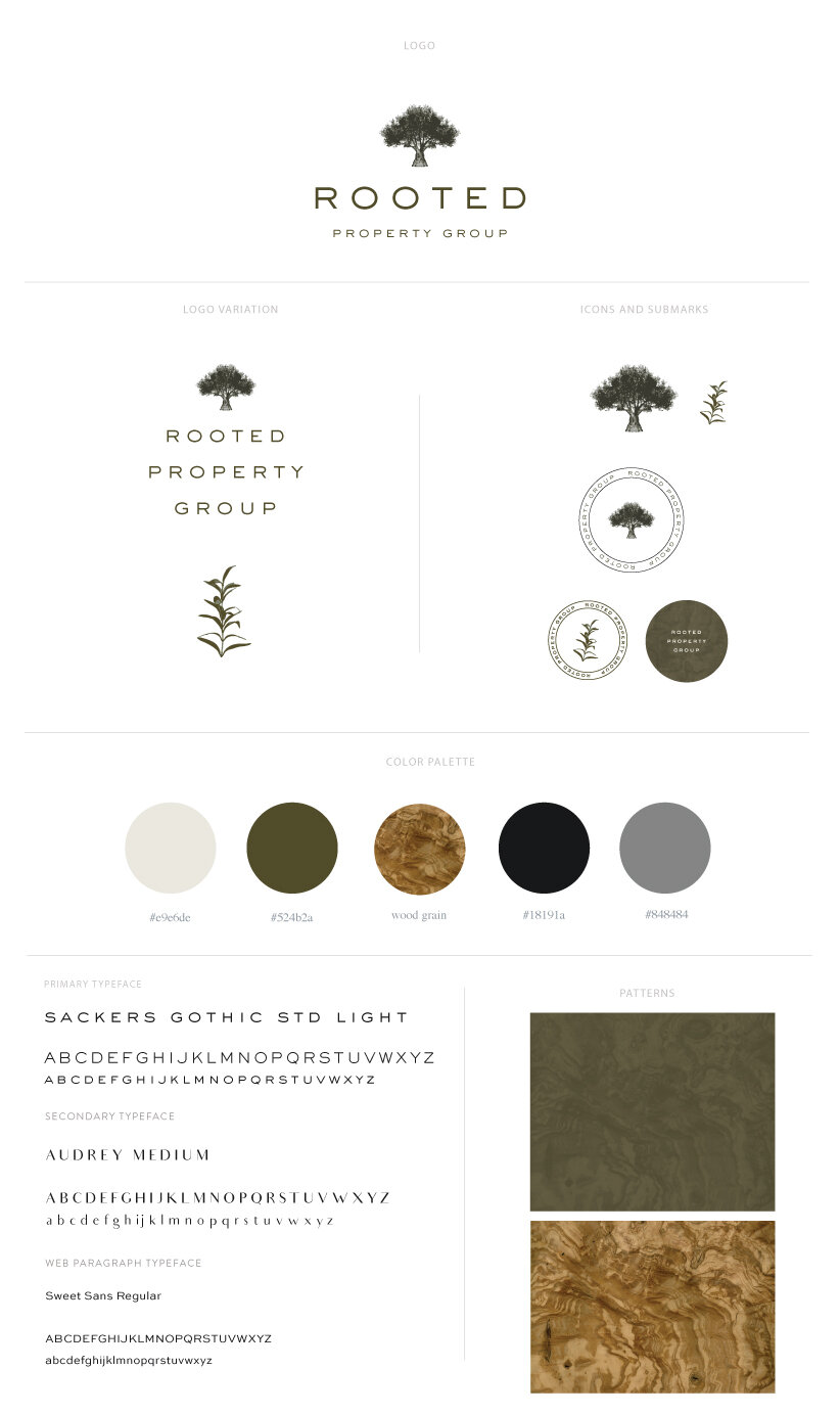
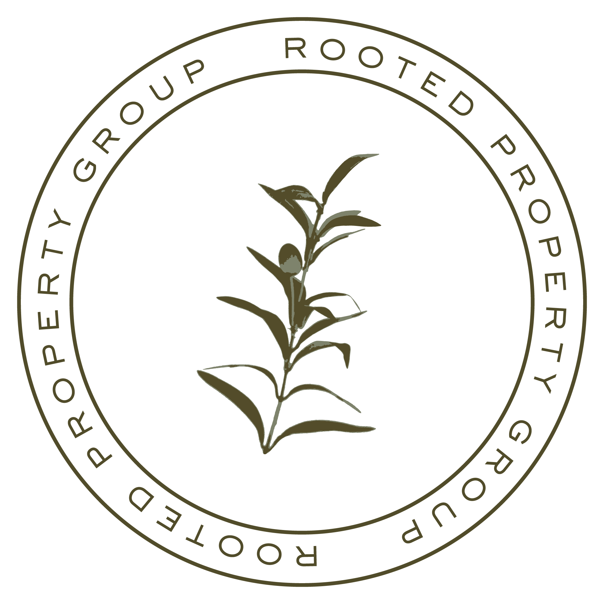
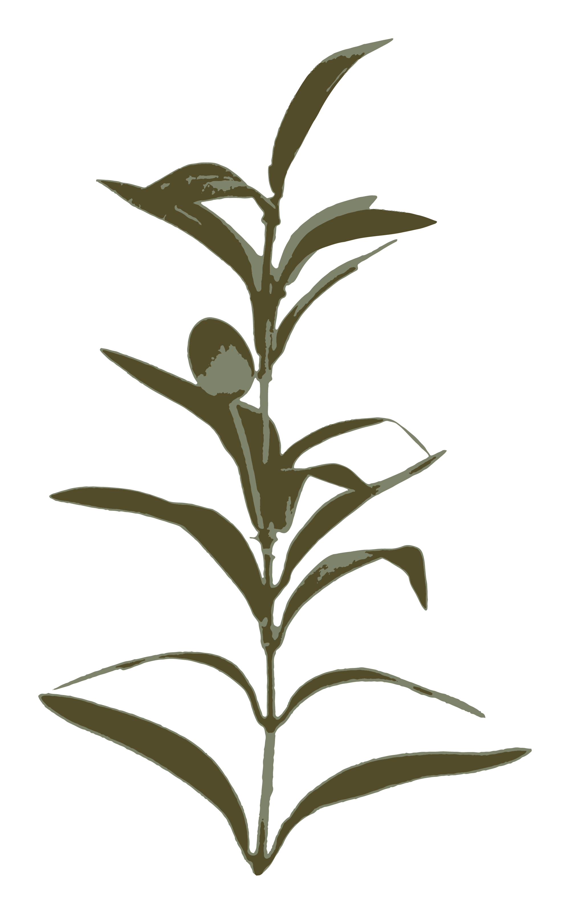
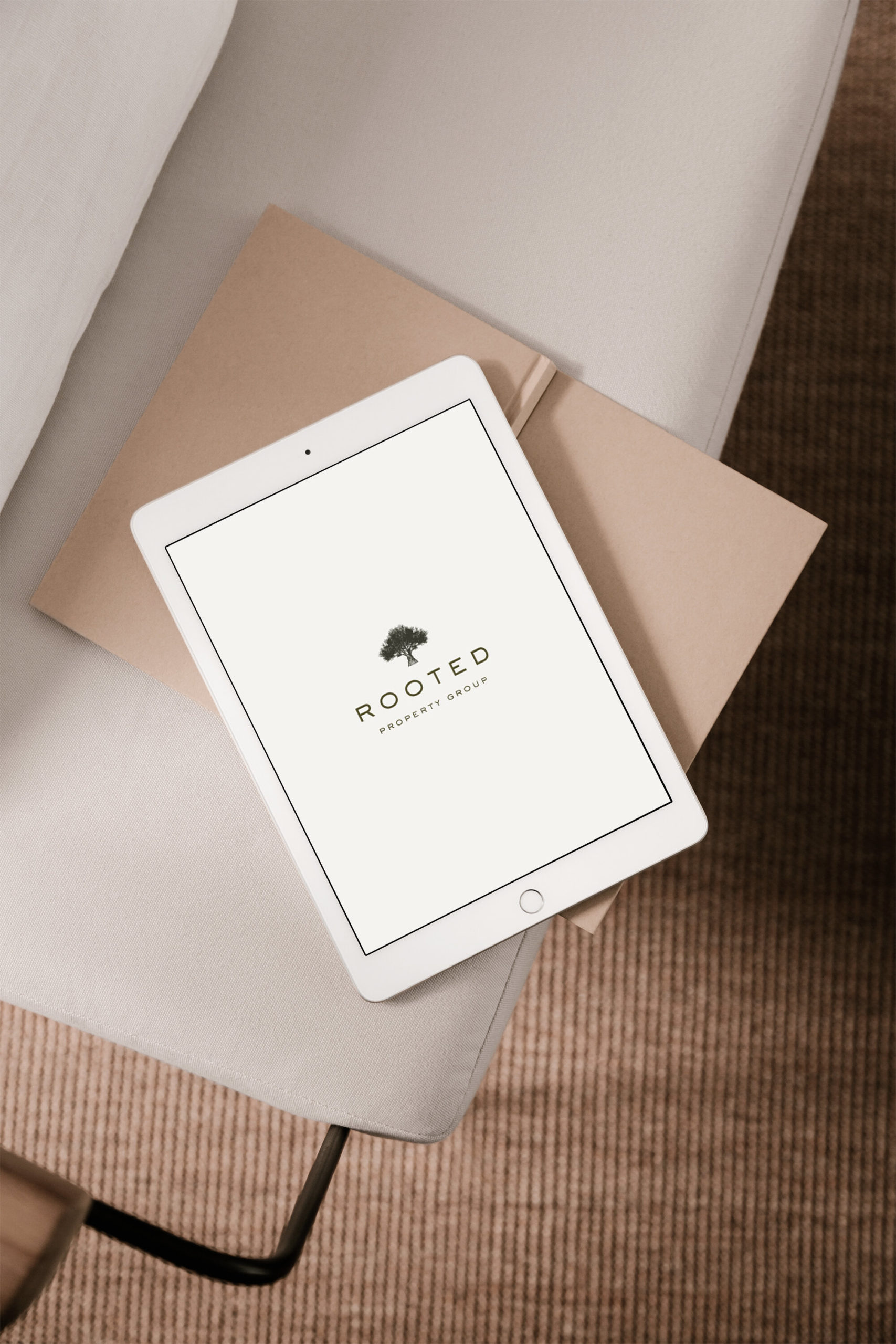
After establishing a strong strategy and direction, it was time to put it into action. I illustrated a very detailed ash olive tree for the main logo and a olive branch for the submark. Since we were using very detailed illustrations, we selected a simplistic sans serif for the main typeface and paired it with a more minimal and masculine color palette. Through these strategic design decisions, we were able to give the brand a more established feel with the goal of creating a credible, confident, and trustworthy brand to attract serious investors.
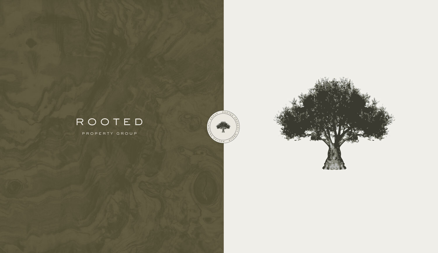
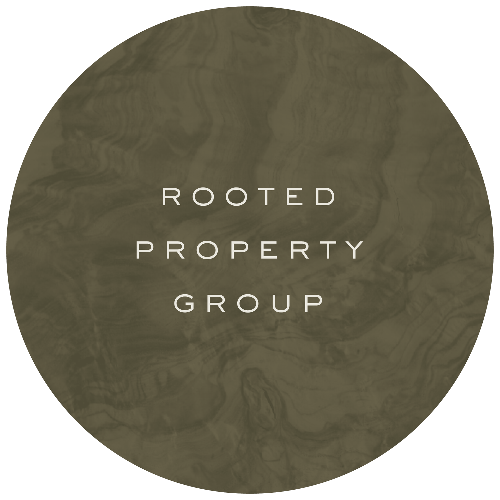
For the brand patterns we went with ash olive burl. I searched high and low for the perfect piece of burl and ended up scanning it in to get the most gorgeous pattern that added a rich texture and complimented the brand perfectly.
Patterns
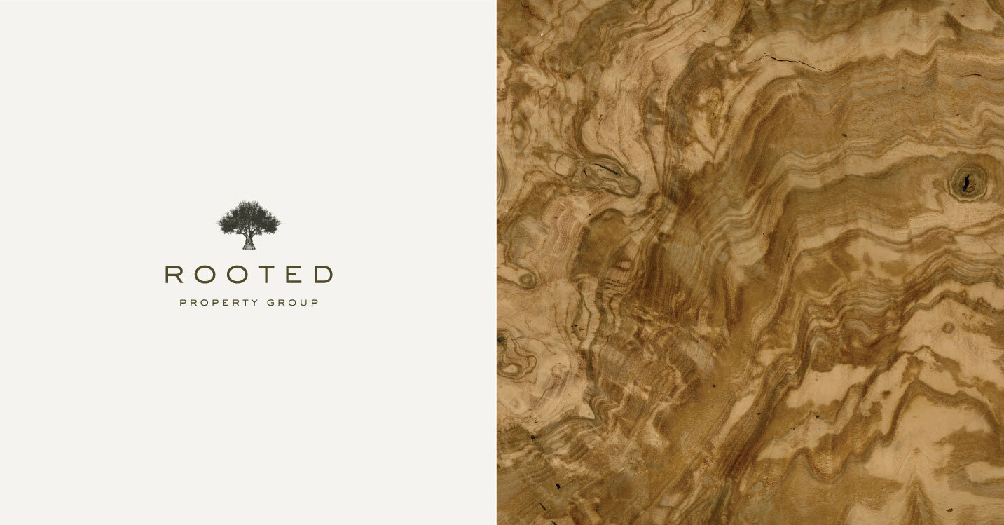

Main Logo
Logo Variations
BRAND ELEMENTS & SUBMARKS
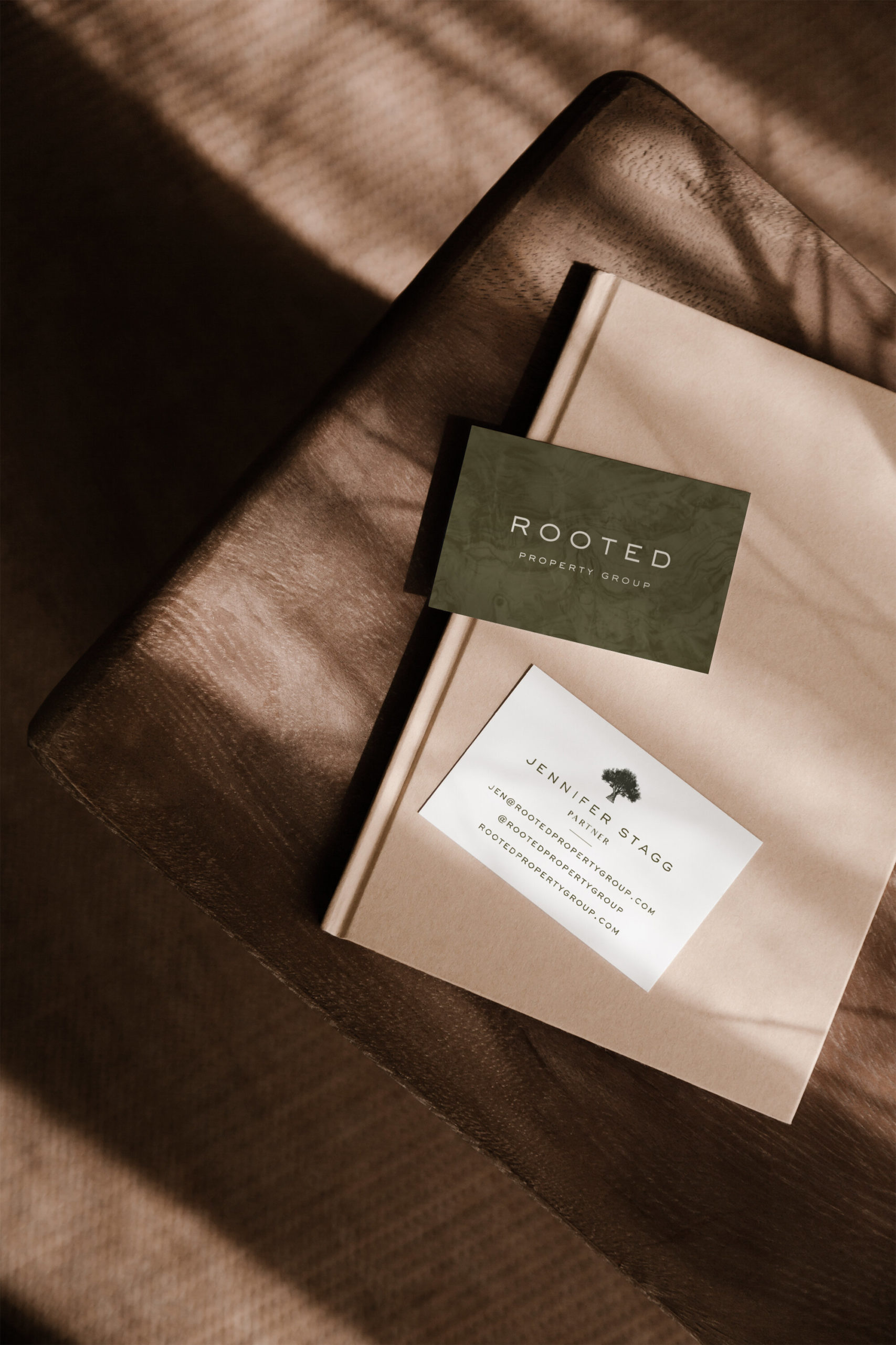
Business Cards
Beautiful branded touch points are the perfect way to carry an elevated experience from start to finish. For Rooted Property Group’s print collateral design, we chose to use the olive green burl pattern as our background and the illustrated ash olive tree as our main brand mark. I absolutely love how striking the green pattern is.
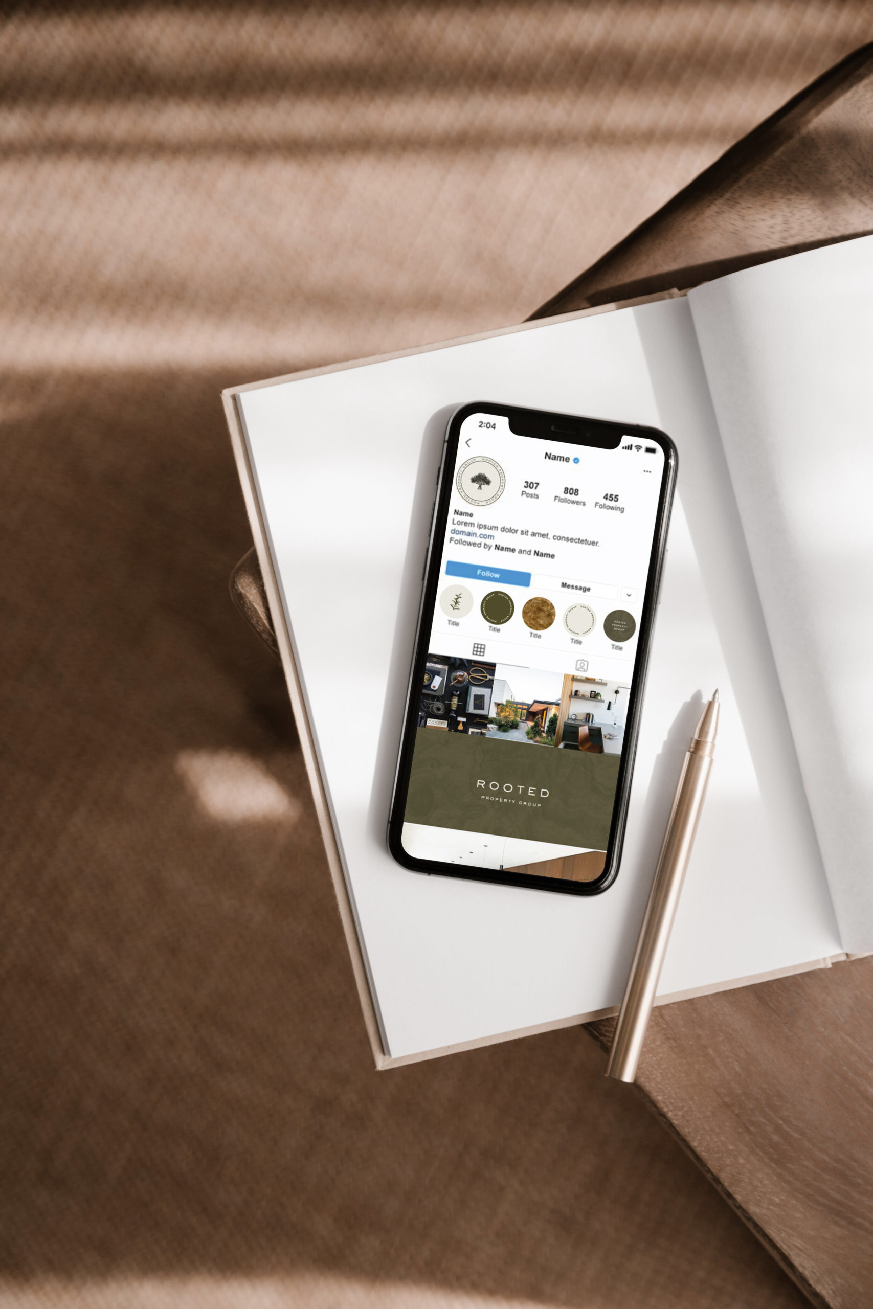
social media direction
Are you ready to elevate your brand? I’m currently booking clients for my Signature Artful Branding experience for summer start dates. If you’re ready to elevate your branding through a strategic approach + custom website design, I would love to talk you through the process and see if we are a good fit for each other! Click below to get started.
Are you are an entrepreneur with a desire to craft a brand that reflects the heart of your business and provides an unmatched experience for your dream clients? Do you want to live a “less but better” kind of life, and want that reflected in your brand? If you want a design that dreams wild, just like you do, then take this short, 2-minute quiz to find out if it’s time for a rebrand in your business!
READ MORE POSTS LIKE THIS
POST CATEGORIES
SEARCH THE SITE
I’m Katie, the brand strategist, designer, dreamer, and entrepreneur behind Artful Brands. Dreamy typefaces, clean layouts, and soft color palettes are my love language— but more importantly designing strategic brands that book.
Welcome


")

Design
Design
Design