Services
Brand Refresh
Website Maintenance Day
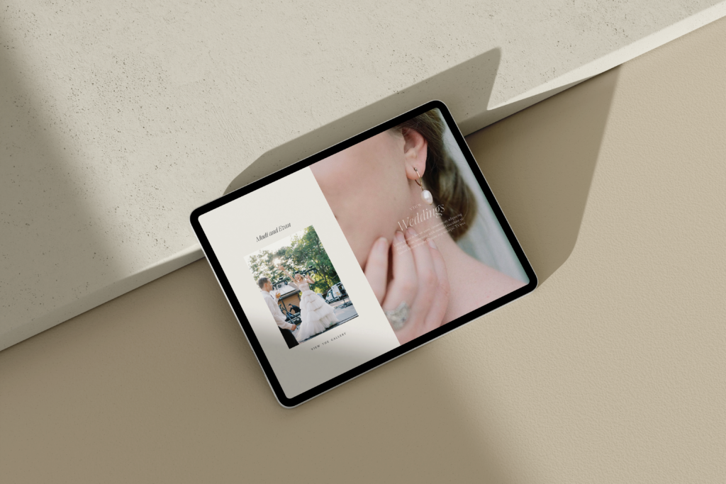
I am so excited to reveal a brand refresh and website maintenance day for my incredible Artful Branding & Website client, HoneyHill Weddings.
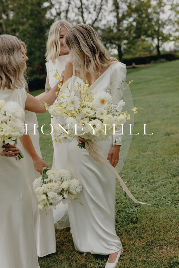
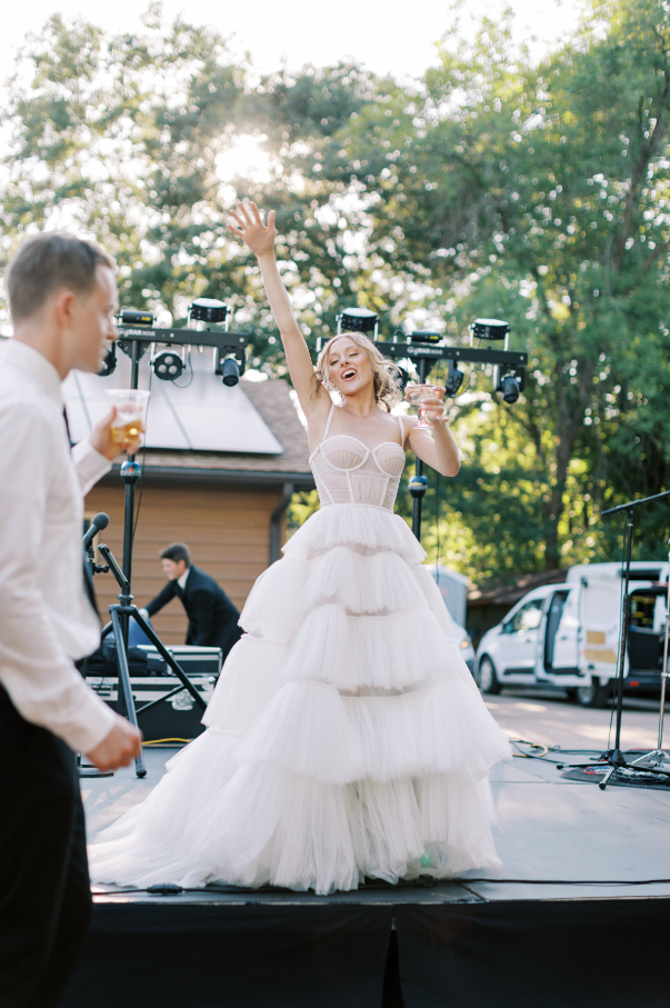
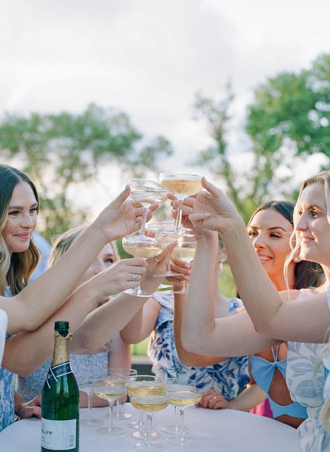
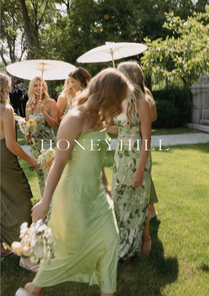
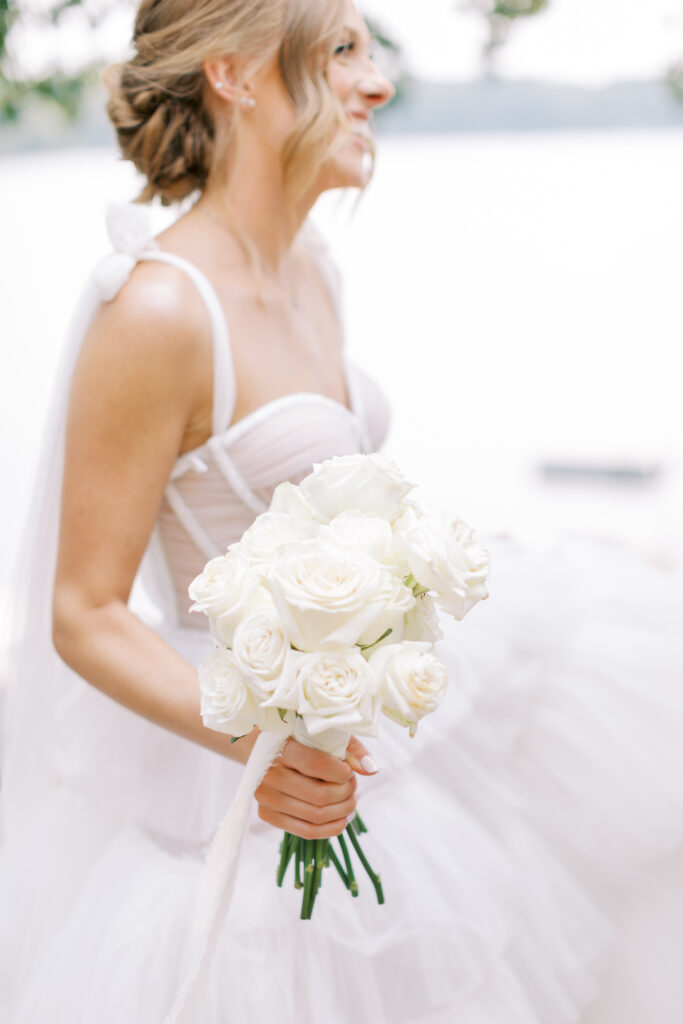
HoneyHill Weddings is a joy-filled, playfully sweet brand with a touch of whimsy, specializing in a range of wedding planning services. Through a carefully curated color palette, romantic typography pairings, and elevated logo marks, we’ve reimagined their brand to encapsulate the essence of joy and playfulness that defines their approach. This rebrand mirrors the aesthetic of their work, while reflecting Cassie’s extensive industry experience, and the high-end weddings she and her team expertly craft and execute from Minnesota to the coast of Italy.
Goals
When clients come to me, it is always about more than just aesthetics- we are always designing to help propel their business forward and outlining goals at the beginning of our project is essential to the design decisions we make. When Cassie first came to me, it was clear she had outgrown her brand and needed a website presence that would support the evolution of HoneyHill.
- Goal 1 Create a brand that reflected HoneyHill’s wedding experience, sweet & whimsical aesthetic, and values of sustainability
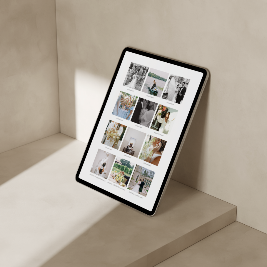
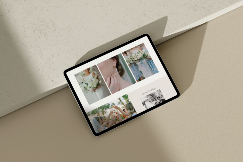
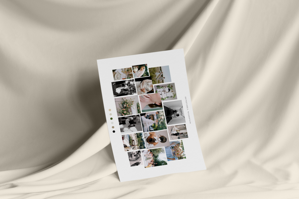
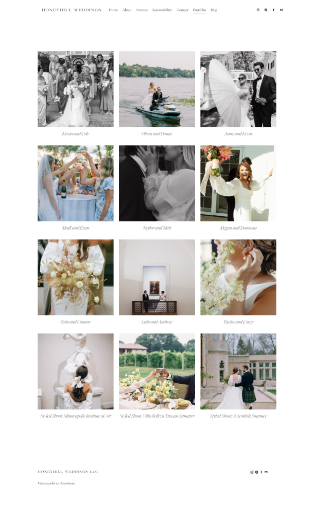
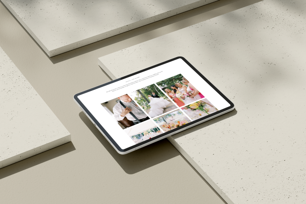
- Goal 2 Showcase the unique weddings the HoneyHill team has planned through a Portfolio page that includes individual galleries of each wedding, includes the vendor team, location, and details from the wedding weekend
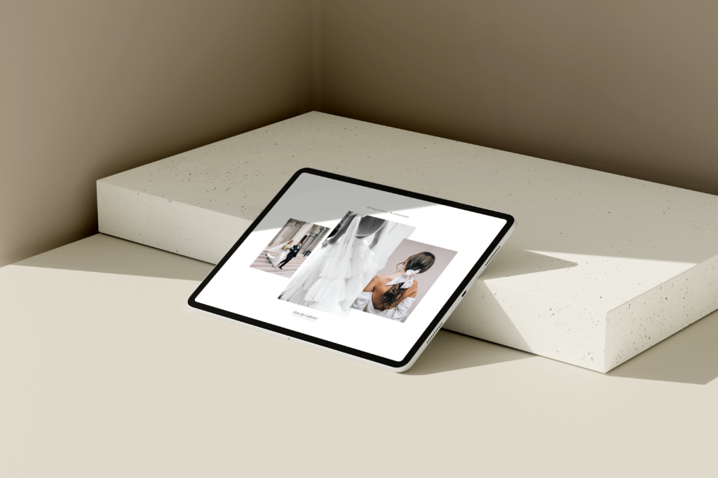
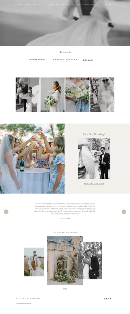
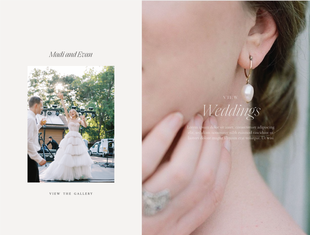
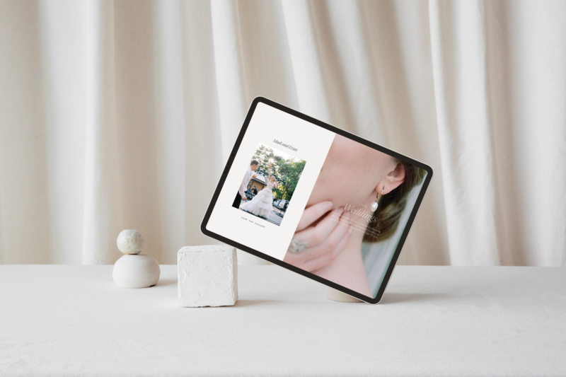
- Goal 3 Update HoneyHill’s existing Squarespace website through a maintenance day where we would thoughtfully put the brand into action with Cassie by our side. We completely refreshed their entire site to reflect the new direction and built out canvases that are now templates in the back end of Cassie’s site so she can easily make updates moving forward.
The Design Process
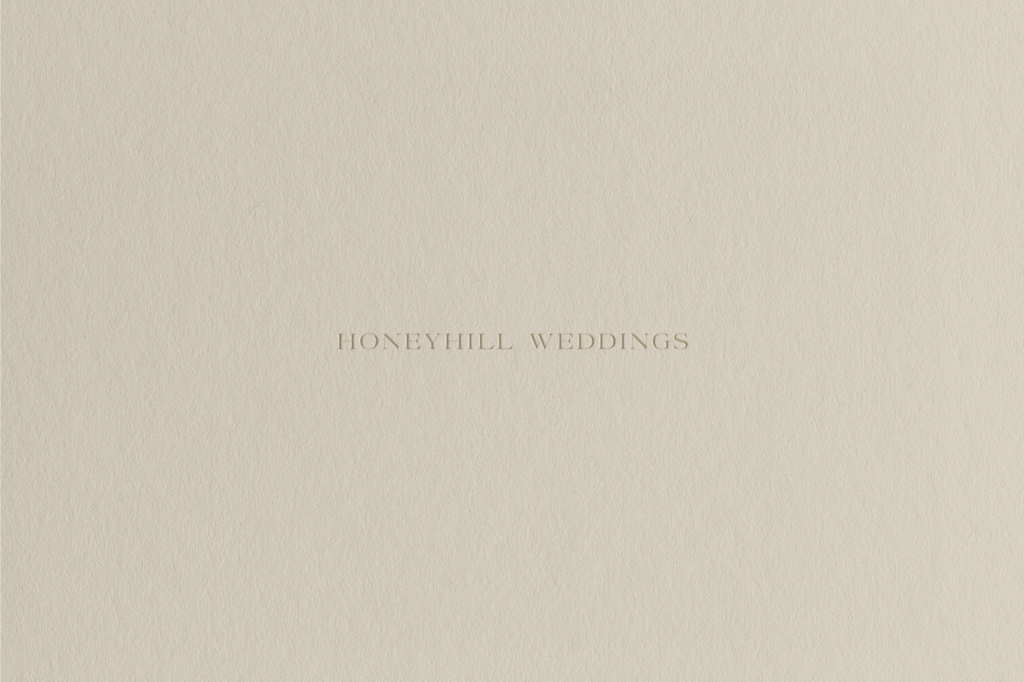
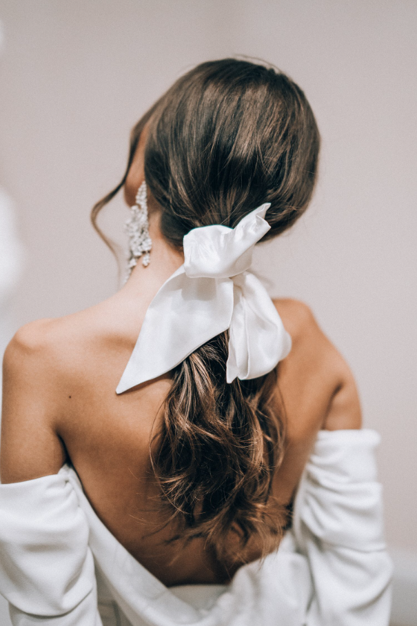
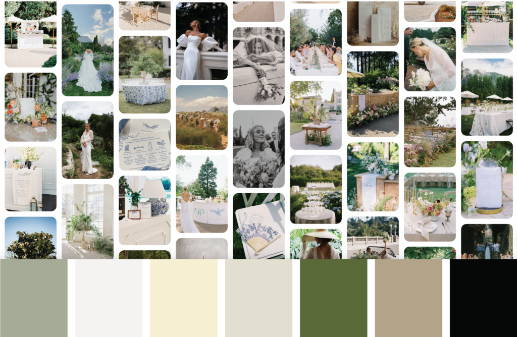
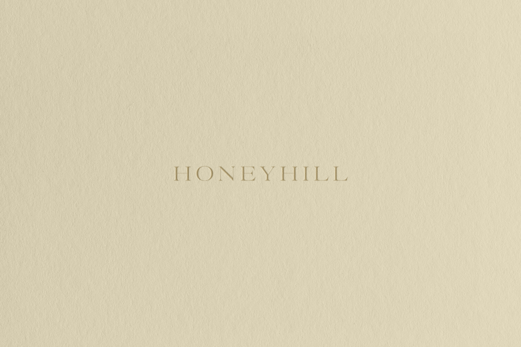
I absolutely loved the design process of bringing this brand to life. We selected a truly unique color palette that included a soft HoneyHill yellow, gorgeous greens, and neutrals to ground the palette. It feels playful yet has a touch of sweetness with whimsical moments woven throughout. The font hierarchy is also a favorite of mine with a stunning serif as our logo font paired with a sophisticated italic that feels just right.
Direction & Color Palette
Logo Marks

Website Maintenance
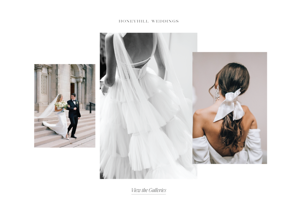
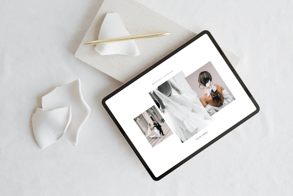
We structured this project as a brand refresh & website maintenance day and it’s one of my favorite service pairings for existing brands because the impact and value is unmatched.
View the Full website here.



Here’s what Cassie from Honeyhill Weddings had to say about working together…
“Katie is incredible at what she does. I felt like she saw the brand so clearly. From my very first inquiry to final file delivery, I felt so taken care of.”
Ready to work together? Let’s connect!
Are you ready to elevate your brand? I’m currently booking Artful Branding & Website clients for Q2 start dates. If you’re looking for a complete brand + custom website design or would like to book our studio for the day, I would love to chat with you and see if we are a good fit for each other! Click below to get started or view all of our services here.
POST CATEGORIES
SEARCH THE SITE
I’m Katie, the brand strategist, designer, dreamer, and entrepreneur behind Artful Brands. Dreamy typefaces, clean layouts, and soft color palettes are my love language— but more importantly designing strategic brands that book.