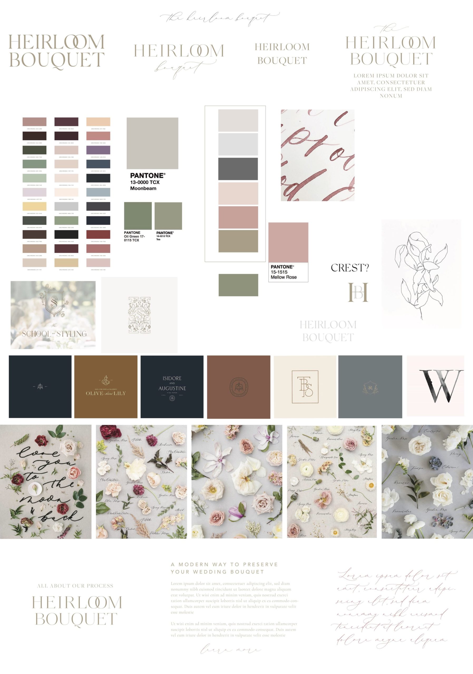
Today I’m letting you in on a BIG secret on how I book clients for my Artful Branding services. This strategy has singlehandedly booked my high-end clients over and over again and it’s an easy change to start implementing into your services: The Direction Board
I used to do a mood board and present that to my clients before the branding process officially began. This didn’t work for me for two reasons: about 95% of my clients aren’t designers (hence why they are hiring me) and really being able to grasp my vision through a mood board wasn’t sealing the deal. Secondly, they were taking me way too long to create- I would spend all of this time sources the perfect images just to realize my clients didn’t really understand the end result and the purpose it was serving. Once I moved to a direction board, I immediately started booking high-end clients, quicker and I haven’t looked back since.
Now, whenever I have a potential client inquire, we will do a call or meet in person so I can learn about their business and needs. I always put together a direction board after the initial meeting before the client has even decided to hire me and here’s a few reasons why. From the client’s perspective it establishes that you really want their business- you’re willing to show them what you could create for them so they have more of an incentive to book with you because now they are starting to visualize the beautiful branding that could be theirs.
I’ve learned this is super important especially when working with businesses in the non-creative fields. Not everyone can visualize design so showing them examples, design inspiration, and color palettes will get them on board faster with the direction I want to take the brand. The second reason direction boards have changed my entire design process is because they cut down on revisions (which we all know is HUGE)!!! Here’s why: A direction board is presenting design styles to your client and it will immediately help you understand what they gravitate towards.
So what’s the difference between a mood board and a direction board?
Direction Boards vs. Mood Boards
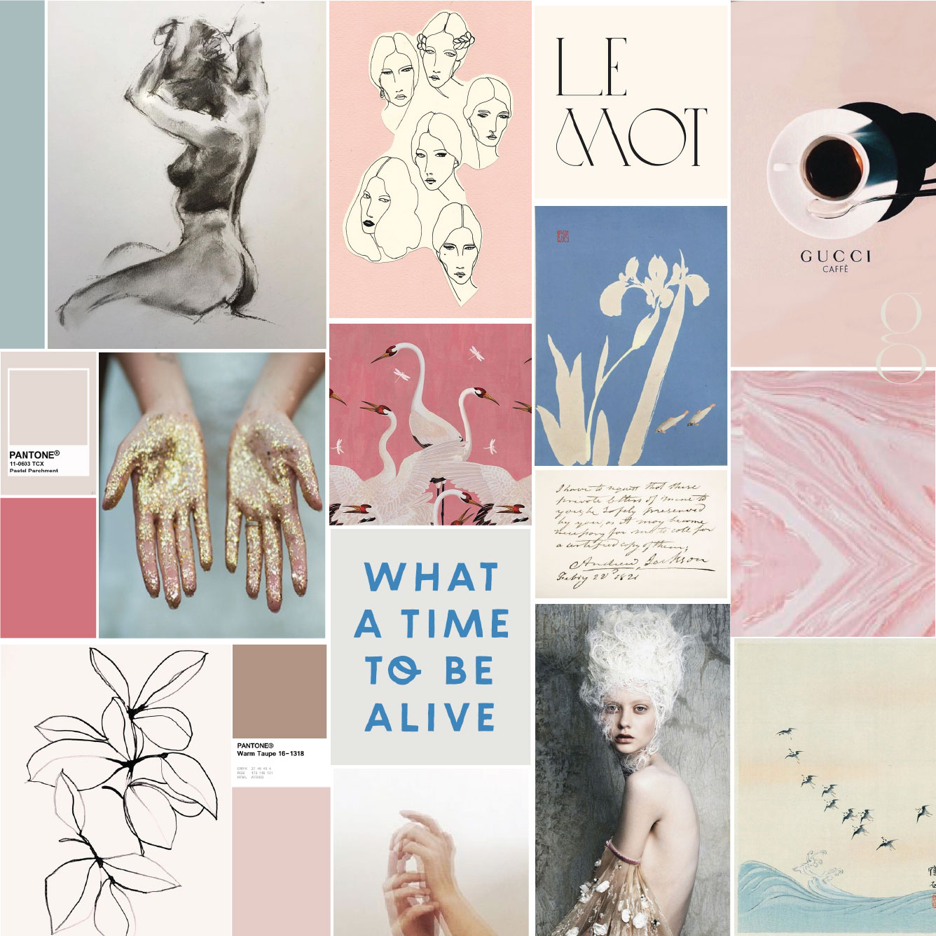
Above is a mood board that I created (for fun) and it definitely sets a mood with the soft color scheme and arftul imagery, but when a client looks at this, they would have a hard time wrapping their head around what direction I would take their logo. I found that mood boards were only giving my clients a sense of the color scheme and not much more than that. I needed to find a solution to this so that my clients could fully trust that I had a vision for their entire project right from the start.
What Makes a Direction Board different?
-
Presenting a full, initial custom color scheme- pantone colors and everything
-
Including design inspiration- logo, submark, font pairing examples
-
Including print collateral inspiration
-
Including pattern design inspiration
-
Including brand imagery that is curated to their new brand- I either curate this from existing imagery if they are already are doing a great job at this or I will pull inspiration for standards of what their brand imagery should look like moving forward.
How Direction Boards Changed my Entire Design Process
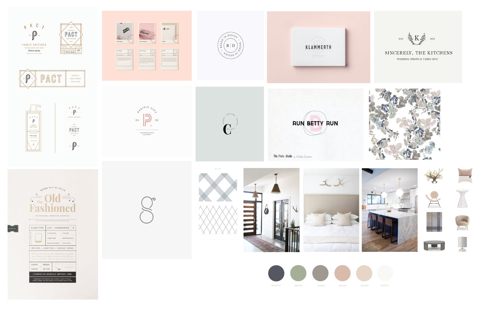
Once I started implementing the use of direction boards into my signature branding process, the amount of revisions I was doing with clients was cut in half. Below is a direction board that I used for the Stagg Design rebrand and this set us up for such success when it came to the actual design for the branding process. I’ve worked with this brand for quite some time now but being able to show the client exactly what I had in mind before I ever started designing for them was a crucial part of this rebranding process. We really used this as a jumping off point for every piece of collateral we designed for both of their sites and all of their print pieces.
Not only did this give them a full picture of what their brand could be, it gave me a better sense of direction too. The client always has an opportunity to give feedback from the initial direction board presentation and in this case, they did not like the feel of the letter “g” I had on the board. With a brand name like Stagg Design, you better nail the look of the g. That saved me so much time knowing that this style wasn’t what they wanted and their feedback of a cleaner typeface saved me hours upon hours of time.
If you haven’t yet tried implementing this into your client process, I challenge you to give it a go on your next project. It has helped me easily book high paying clients over and over again.
TOP POSTS ON THE BLOG
POST CATEGORIES
SEARCH THE SITE
I’m Katie, the brand strategist, designer, dreamer, and entrepreneur behind Artful Brands. Dreamy typefaces, clean layouts, and soft color palettes are my love language— but more importantly designing strategic brands that book.
I love this idea! An especially doing this right after that initial call. Question: have you ever had a client totally not vibe with the direction board?
Hi Ashleigh! I never have had a client that didn’t love their overall direction. I do jump on a call or send over a video of me walking them through each element on the board and why it’s there. I also give them the opportunity to make revisions on the board. I’ve had a few clients that didn’t love one or two elements on their board and we just took them off but that’s the whole point of it anyway! I’ve had such success with this method. Give it a try!
I like the idea of walking them through it with a video! I solely do web design right now, so I’m curious how I could fit this in along with the Pinterest mood board that I have clients do during their homework. I’m thinking it might replace it.
Yes! Replace it. When I was creating my signature brand experience, this was something I looked into a lot. I used to have clients give inspiration to me. My business coach told me to stop- it seriously changed everything. It established me as the design expert and really allowed me to guide my clients through a strategic design process.
I’m confused – the direction board and mood board don’t seem to be that different?
Hi Sienna!
Thanks so much for reading 🙂 There are slight differences between the two that have made a huge impact for my branding process with clients. The second image down is a mood board- it will just have images on it. The direction boards will have font pairings, full color schemes, logo & submark examples, and often print collateral direction. Hope that helps to clarify the differences!
Hello! Loved your post! What platform or software do you use to create your direction boards?
Hi Grant!
Thank you so much for reading 🙂 I’m so glad you found it helpful. I use Illustrator to design my direction boards but you could also use Canva (which is free- a lot of my non designer clients use this) or Photoshop and Indesign would work as well. I will be releasing free templates for mood and direction boards shortly in my freebie library so be sure to sign up for my newsletter so you’ll get those when they come out.
What do you think of creating a Pinterest board as a direction board. I’m thinking of adding 3-4 more questions on the discovery call questionnaire and having the direction board ready to present during discovery
Hi Denise! Thanks so much for reading. I love the idea of having the direction board ready during the discovery phase. I personally have moved away from using Pinterest in my client process (don’t get me wrong I love Pinterest) I just found that having the direction board organized off of Pinterest was really helpful for myself and clients- it’s easier for me to deliver in dropbox and a bit more organized. That’s just what works for me though!
Hey! Where do you source images from? Or, did you mean that you use Pinterest to find the imagery, but present it to the client in a different way?
I source from unsplash, pinterest, kate max stock, sc stockshop and sometimes I’ll pop a few of my client’s brand photos onto the direction board!
Thank you!