If you had to choose one investment this year for your business, I highly recommend brand standards. I’m so passionate about what a style guide (or brand standards) can do for businesses that I’ve made it my life’s work to build beautiful brands from the ground up. Today, I’m going to explain why brand standards are so important to maintaining a strong, cohesive look and feel across all of your platforms, how they can help you establish brand recognition if used properly, and why this has such value for your business.
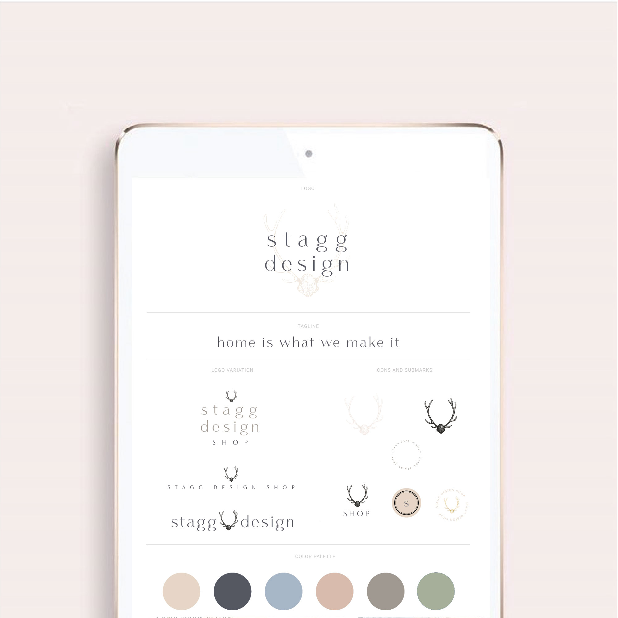
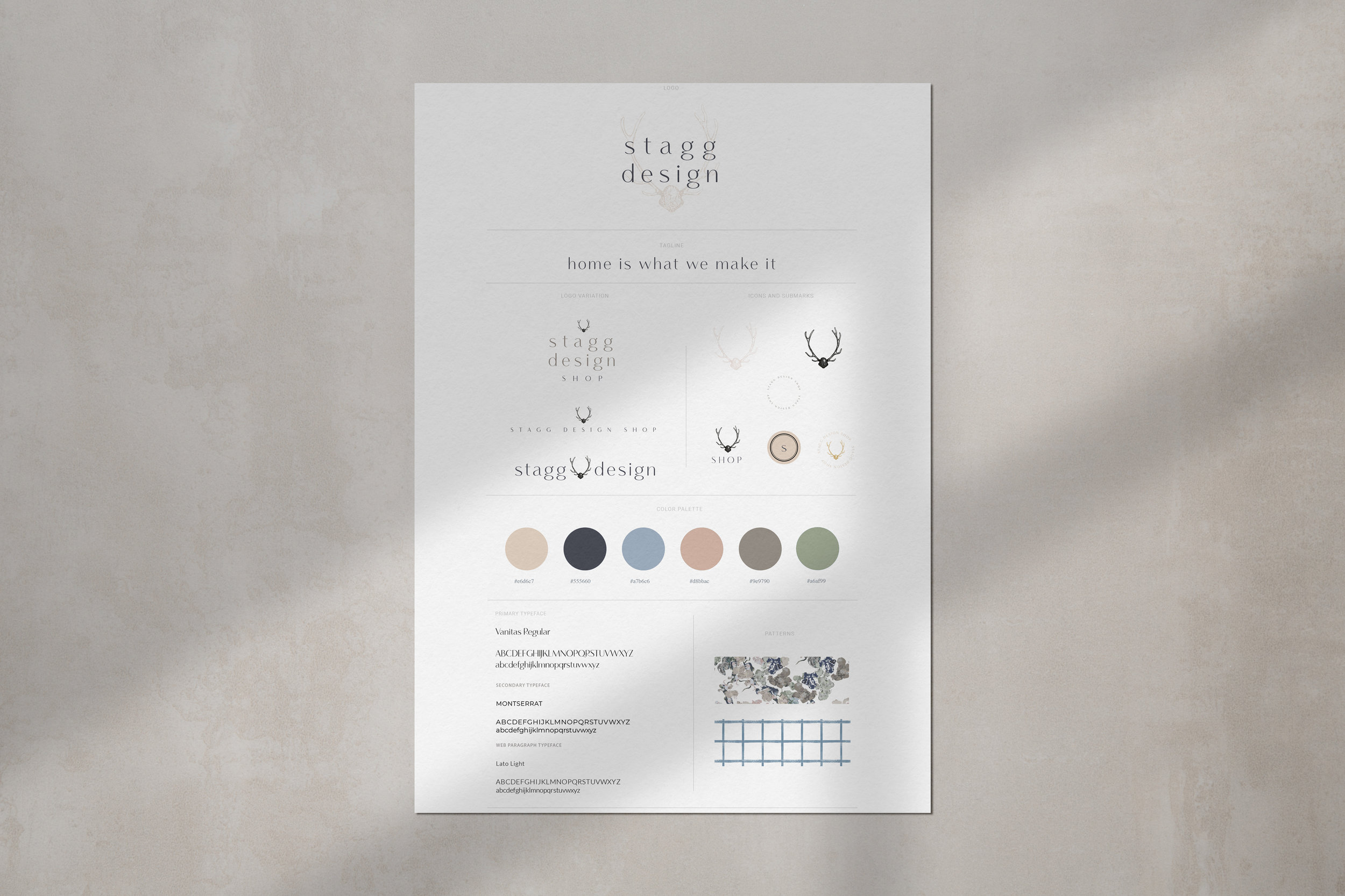
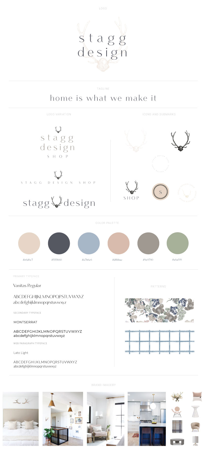
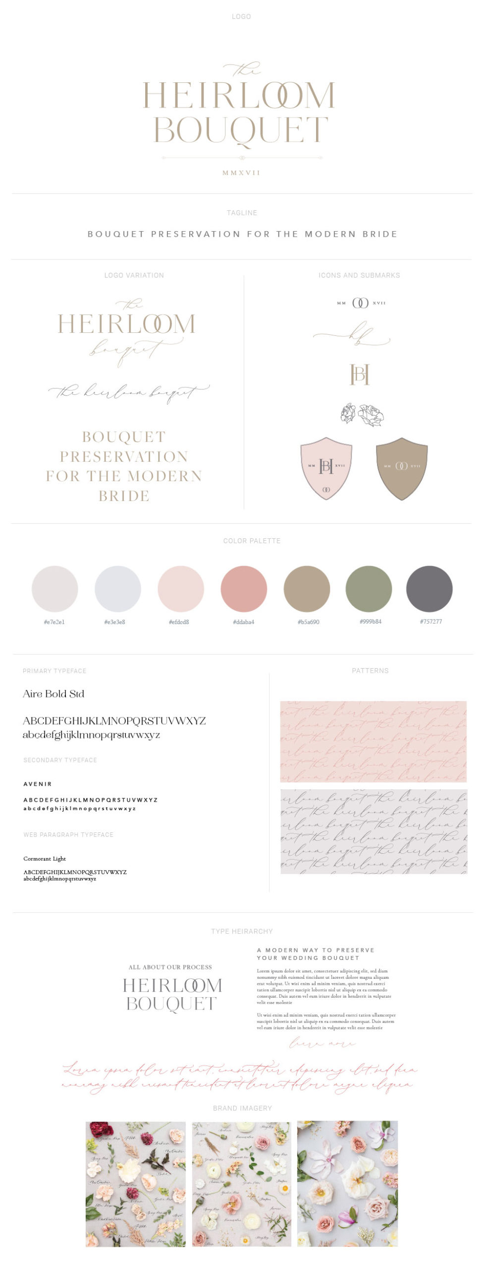
First of all, let’s go over what exactly a style guide or brand standards (you’ll hear me reference both terms) are. Below are a few examples of what our clients walk away with after working with us.
elements to a style guide
Our style guides include:
-
primary logo
-
tagline
-
secondary logo options
-
submarks
-
a color palette with hex values, CMYK, pantone spot colors, RGB values
-
font pairings
-
custom patterns
-
brand imagery standards
Brand standards can go much more in-depth as well. Often times you will see formatting rules like how much white space should be around the logo and very detailed design rules to play by. The point of including all of these details is so the look and feel of the brand stays consistent no matter where it is placed, who is designing for the brand, or where it is reproduced- print, web, etc.

consistency is key
It’s so important to have a cohesive look and feel on every single touch point you have with your customers. If you don’t have a clear message (brand vision, brand values, brand voice, brand visuals) that you’re delivering, it’s going to be confusing to the customer. We want to create a strong, cohesive, recognizable brand that resonates with our target audience.
Essential for growth
If you have a team or plan to grow your team, brand standards are essential. It’s a huge resource to get everyone on the same page right away. One of the teams I design on just expanded to include another designer and it was so simple to share one document with her to ensure she knew what exact colors we use where and which logo types to use on what collateral. Not only did it save us time by already having these standards set in place, it saves the brand a lot of money in the long run because their designers are not reinventing the wheel every time we design for them. Whenever I design for a new client, I ask if they have brand standards to reference and if not, it always adds on several hours to the project because I have to come up with a look and feel on my own for the project.
Increases value
When a brand’s identity is cohesive, it increases the brand’s perceived value. By implementing the standards throughout, you appear more professional and reliable. A style guide makes it much easier to maintain the quality and integrity of your brand’s image and in turn, you will become more recognizable to your ideal customer.
I’m so passionate about brand standards because I’ve seen first hand the value they have for the brands that I have worked with. There is a reason we prioritize this so much in our design work. Not only am I passionate about building beautiful brands from the ground up, I want you to be confident using this tool for your business whether you’re a designer or not. We always sit down with our 1 on 1 branding clients and walk them through their style guide and make sure they understand the purpose behind the design and how to implement each piece. Nothing breaks my heart more than to work with clients on a beautiful brand and then see it sit there and not be put out into the world because it’s too intimidating as a non designer to put it into action.
I wholeheartedly believe in my clients to implement their brands and make sure they are equipped to do so after our education/implementation piece to our signature Artful Branding process. There is nothing more fulfilling to me than seeing the brands I’ve created out in the wild thriving.


POST CATEGORIES
SEARCH THE SITE
I’m Katie, the brand strategist, designer, dreamer, and entrepreneur behind Artful Brands. Dreamy typefaces, clean layouts, and soft color palettes are my love language— but more importantly designing strategic brands that book.