Typically when I design a new product the idea just comes to me and I make it the next day. Sometimes it isn’t that easy. Especially if I’m designing for a client or coming out with a line of products that need to have a cohesive look (I am in the process of doing this right now). I want to share a little behind the scenes of one of the latest projects that I teamed up with designer, Jenna Cossette to bring to life.
This is the first project we worked on for Shaynah aka Ruffled Snob. I absolutely adore her and I could not have been more excited or flattered that she asked me to do some design work for her. The first thing I do when I’m working with a client is ask for a picture for inspiration. Typically this is a good indication of the aesthetic a client wants and then I can start my own brainstorming process. Here is the process Jenna and I went through to complete this project//
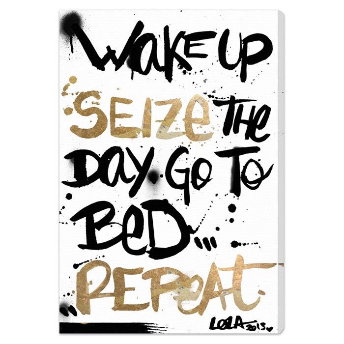
1// The inspiration from Shaynah. This is the color scheme she wanted but less graffiti style.
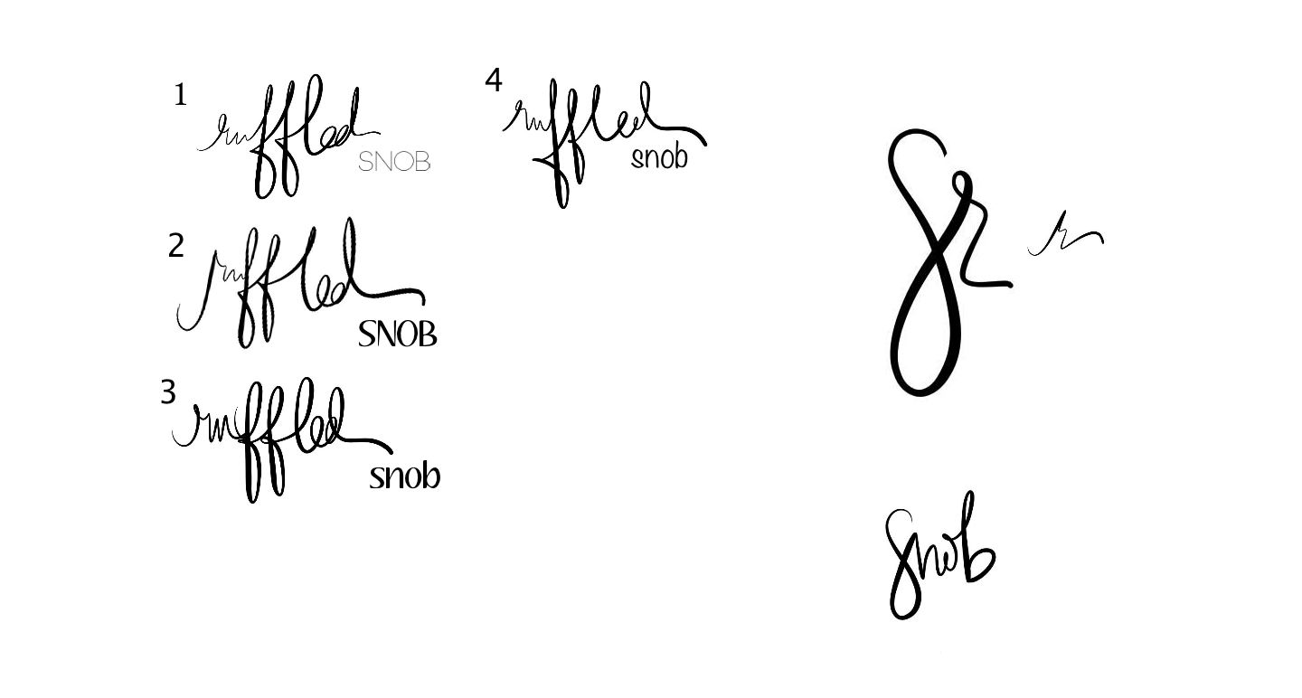
2// This is what my brainstorming/sketching process looks like. I really like sending over several options for clients. Since I am the designer, I like to present all of the ideas and then let the client say yes I like this or no I want this instead.
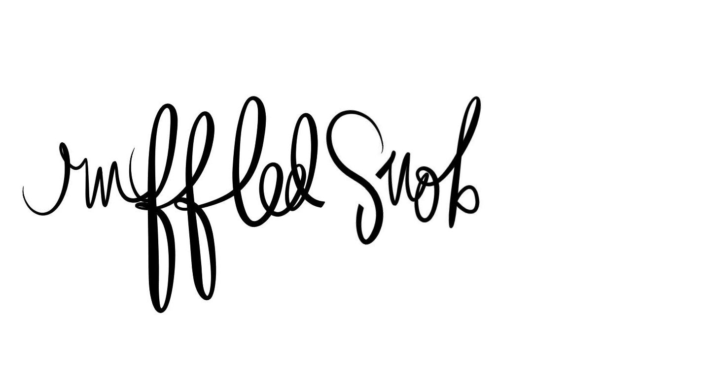
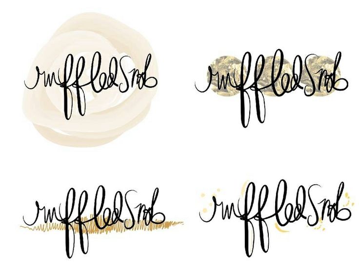
3// Shaynah wanted it all in my handwriting so I switched up the snob font to a larger handwritten snob. I let her choose from two different illustrated snobs.
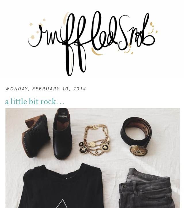
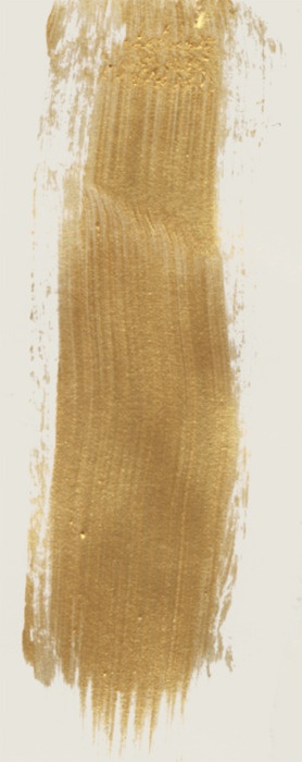
4// This is where the lovely Jenna comes in. This design stuff is WAY out of my element (I am technically just an illustrator but I will be learning soon) so I am very thankful for Jenna. She came up with a few different shades of gold and different looks to present.
5// Shaynah decided on the gold color she wanted and the design. We combined a few different elements and came up with a fab design to live on her blog! Thank you so much for letting me be a part of your blog redesign Shaynah.
I love the process of designing. It is a lot of back and forth between the client and me and me and Jenna but it is so rewarding seeing something that I have created on my favorite blog.
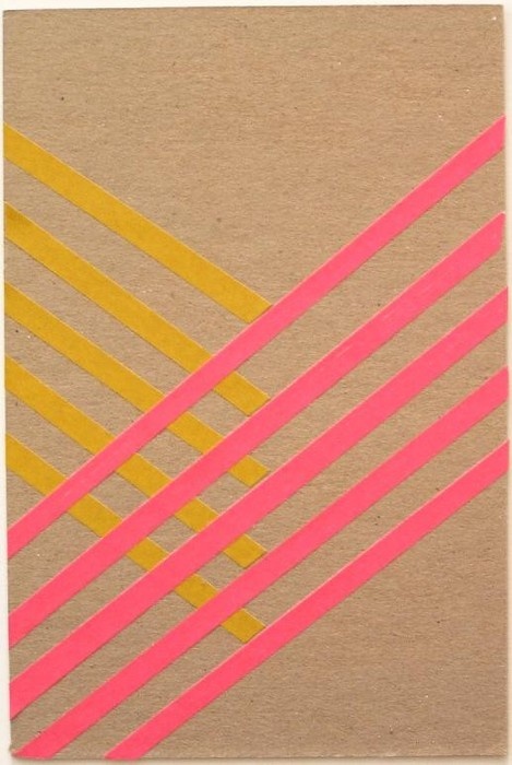
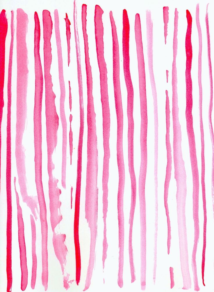
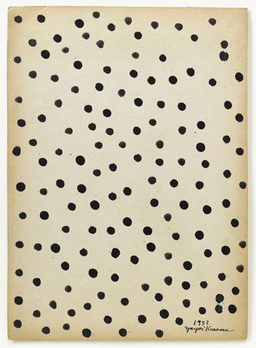
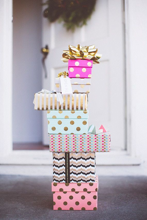
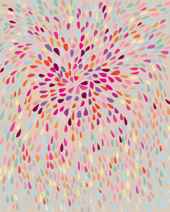
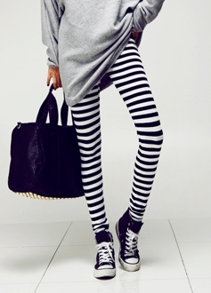
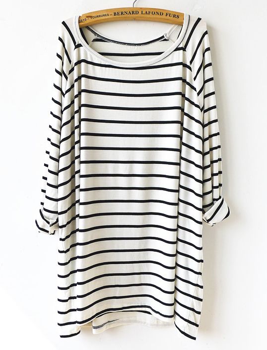
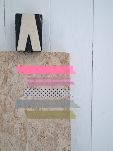
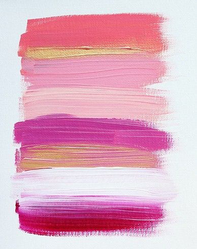
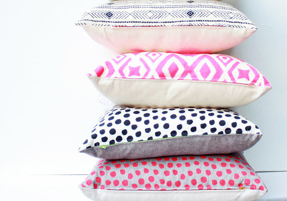
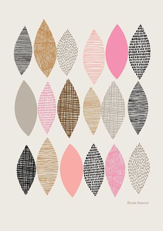
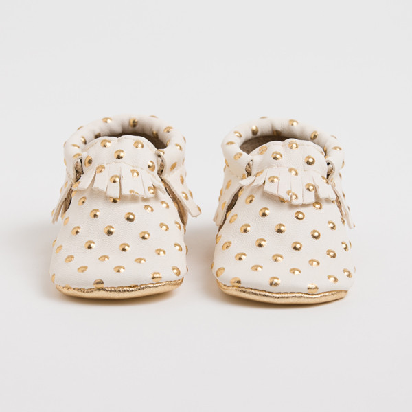
This next project is one that I’m incredibly excited about and that is always fun. I’m coming out with a line of phone cases and every time I sit down to work on this project it reminds me that I am fortunate enough to be doing my dream job. This project was abandoned for a while because I couldn’t clearly define what I wanted the line to say. I made this inspiration board and it instantly fixed that problem. I want this line to say queenikathleeni all over it and for me that means pink, always pink. As you can see, it will be filled with color, something I haven’t experimented with on my cases yet. I will also be coming out with intricate patterns and hopefully some pops of gold and watercolor if I can figure out the logistics on that. This idea stemmed from some of the best advice I’ve received from a local letter-press company, “make what sells, unless you don’t want to make it.” That piece of advice will stick with me for the rest of my career. I want to make this line so bad and my “hello doll” case is my best seller so there you have it. I’m hoping to launch this by April. That gives me a full month of being a full-time designer to work on this. Do you want to re-read that last sentence?! Let the fun begin.
xo-
qk
POST CATEGORIES
SEARCH THE SITE
I’m Katie, the brand strategist, designer, dreamer, and entrepreneur behind Artful Brands. Dreamy typefaces, clean layouts, and soft color palettes are my love language— but more importantly designing strategic brands that book.
Can’t wait to see your phone cases – I’m loving your inspiration board! Will you do them in iPhone 4S for those of us that haven’t upgraded yet?
Hi Kelley!! Thanks so much for your encouragement! This is such a fun project for me. I will offer iphone 4S as well as 5s because I haven’t upgraded yet either 🙂
xo-
qk